Value Properties – Luxury Real Estate Brand & Digital Experience
Redefining ultra‑luxury real estate discovery through clarity, trust, and experience‑led design in mumbai
About the project
Value Properties is a Mumbai‑based luxury real estate agency specializing exclusively in high‑end residential and investment properties. The brand caters to HNIs, UHNIs, and global buyers seeking curated access to premium homes across Mumbai’s most prestigious locations.
The challenge was to design a digital experience that matched the caliber of the properties themselves elegant, restrained, confident while clearly communicating value, exclusivity, and trust. The outcome was a refined brand system and digital platform that elevated perception, improved inquiry quality, and positioned Value Properties as a pure luxury authority, not a generic brokerage.
Problems
Luxury real estate platforms often fail not due to lack of inventory, but due to poor brand signaling and weak experiential design.
- Websites felt transactional rather than curated
- Overcrowded listings diluted the sense of exclusivity
- No emotional storytelling around properties
- Generic layouts similar to mass‑market portals
- Weak trust cues for high‑ticket decision making
- Lack of clear differentiation in a saturated luxury market
User Insight: Luxury buyers value discretion, clarity, and confidence more than volume or speed.
Challenges
The core challenge was designing for a low‑frequency, high‑trust decision journey. Luxury property purchases are infrequent but significant investments, requiring a design that builds confidence over time without overwhelming users.
- Balance minimalism with sufficient detail for informed decisions
- Create a luxury feel without visual excess
- Design for global buyers unfamiliar with local markets
- Convey credibility and expertise instantly
- Prioritize quality of leads over quantity
Our Approach
We adopted a luxury‑first, experience‑led design methodology, inspired by high‑end hospitality, fashion, and private banking rather than traditional property portals.
Research & Strategy
- Analysis of global luxury real estate brands (UK, Dubai, NYC)
- Interviews with high‑net‑worth property buyers
- Mapping emotional and rational decision triggers
Brand Positioning
- Positioned Value Properties as a private property advisory, not a listing site
- Messaging centered on curation, discretion, and long‑term value
Information Architecture
- Fewer listings, deeper storytelling
- Clear segmentation by lifestyle, location, and investment intent
- Progressive disclosure of sensitive details
Visual & UX Strategy
- Editorial layouts inspired by luxury magazines
- Strong use of white space and restrained typography
- Property visuals treated as hero content
- Narrative‑driven sections rather than dense data blocks
Key Design Solutions
The design solutions focused on elevating the brand experience while ensuring usability for high‑value users.
- Hero‑led property storytelling instead of grid‑based listings
- Location‑focused discovery (South Mumbai, Bandra, Juhu, etc.)
- Investment‑ready property presentation with clear value indicators
- Trust layers: experience highlights, advisory tone, client discretion cues
- High‑intent CTAs (Private Viewing, Request Details)
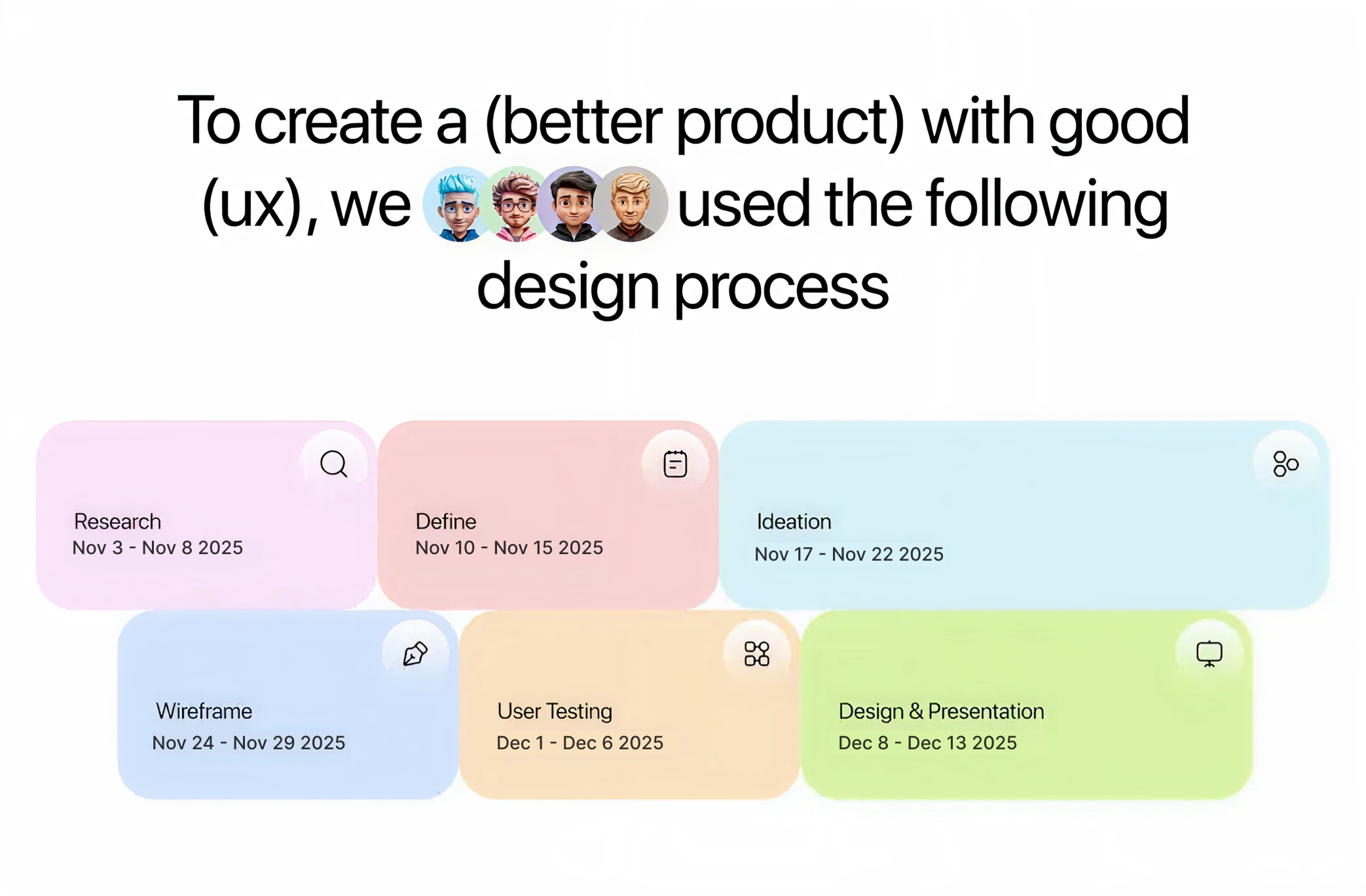
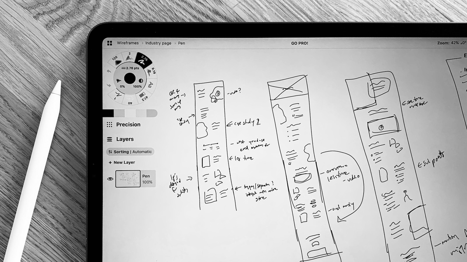
Sketch
The sketches focused on key user flows and layout concepts that emphasized luxury and clarity. Key elements included:
- Immediate brand credibility above the fold
- Clear property hierarchy without visual clutter
- Intuitive navigation between locations and property types
- Prominent trust signals (experience, discretion, expertise)
- Seamless journey from discovery to private inquiry
- Mobile‑first layouts for on‑the‑go decision makers
Style Guide
This style guide captures the sophisticated branding for Value Properties, a premium Mumbai real estate brand targeting high-net-worth clients with sleek skyscrapers and exclusive properties. Use it for case studies to maintain visual consistency across websites, proposals, and social media.
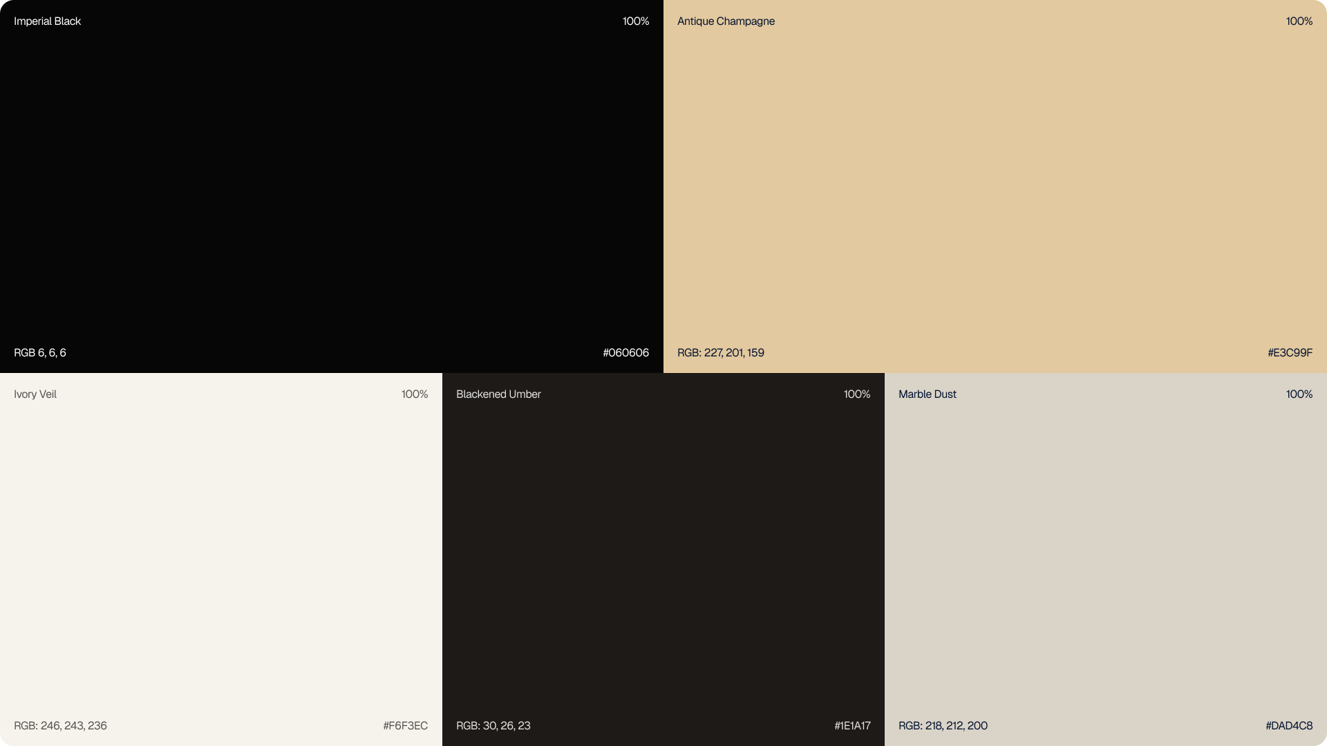
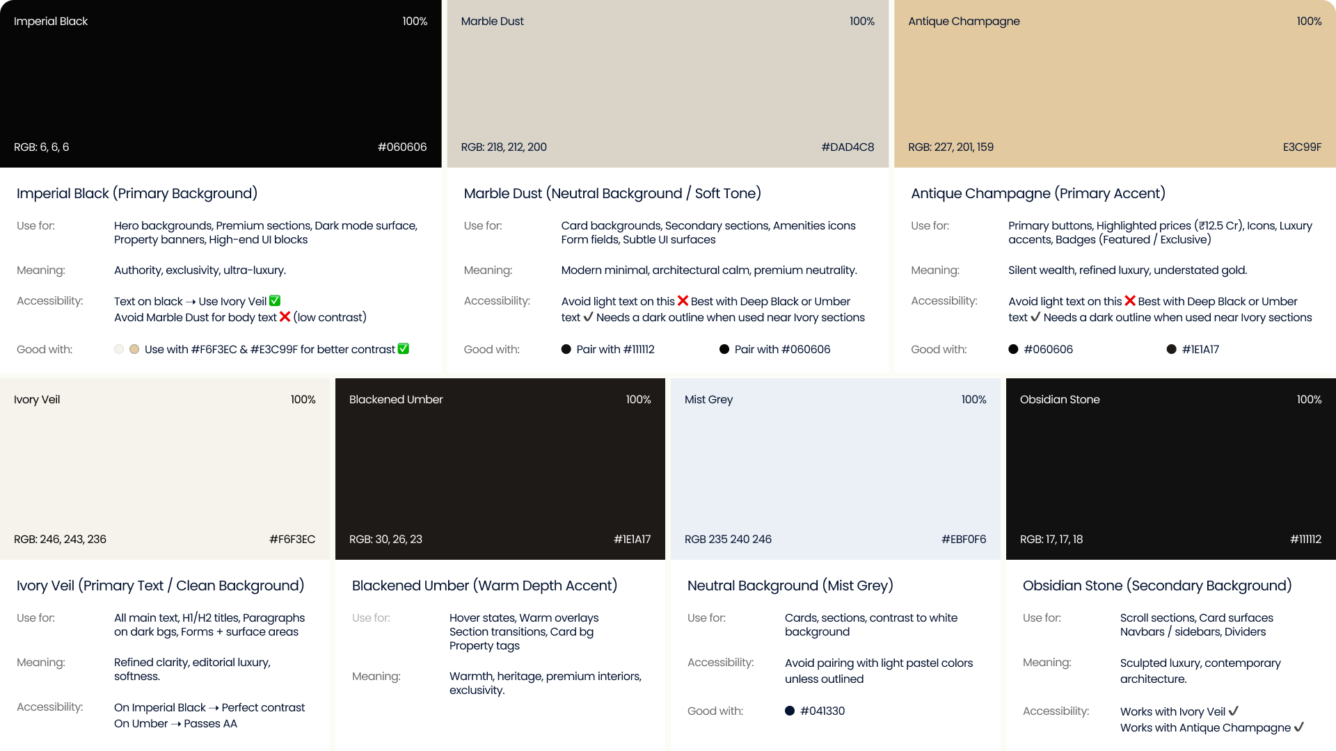
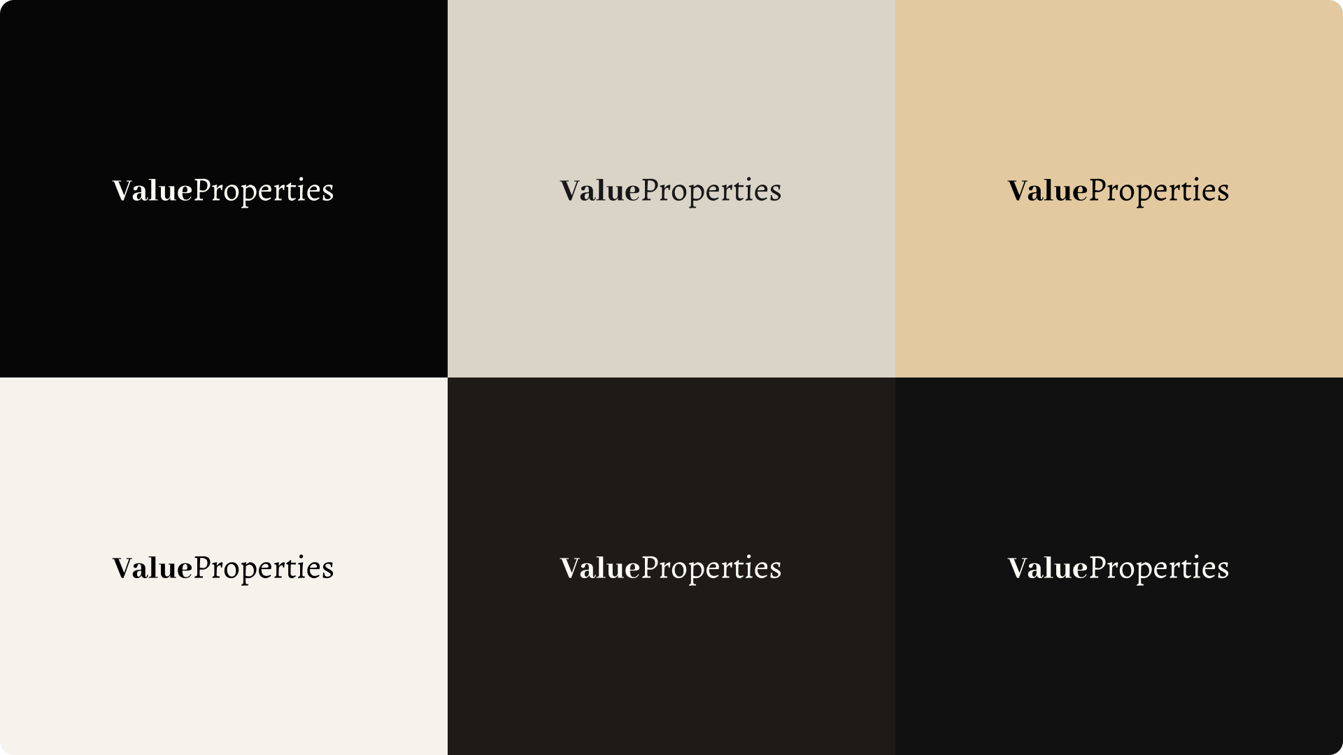
Color Palette:
Draw from the black, beige, off-white, and gold tones dominating the design for an elegant, exclusive feel suited to luxury Mumbai properties.
- Primary Black (#000000, RGB: 0,0,0) – Backgrounds, text on light
- Off-White/Beige (#FAFAFA, RGB: 250,250,250) – Cards, subtle overlays
- Warm Beige (#F5F5F0, RGB: 245,245,240) – Secondary backgrounds
- Gold Accent (#D4AF37, RGB: 212,175,55) – Logos, highlights
- Deep Gray (#333333, RGB: 51,51,51) – Secondary text
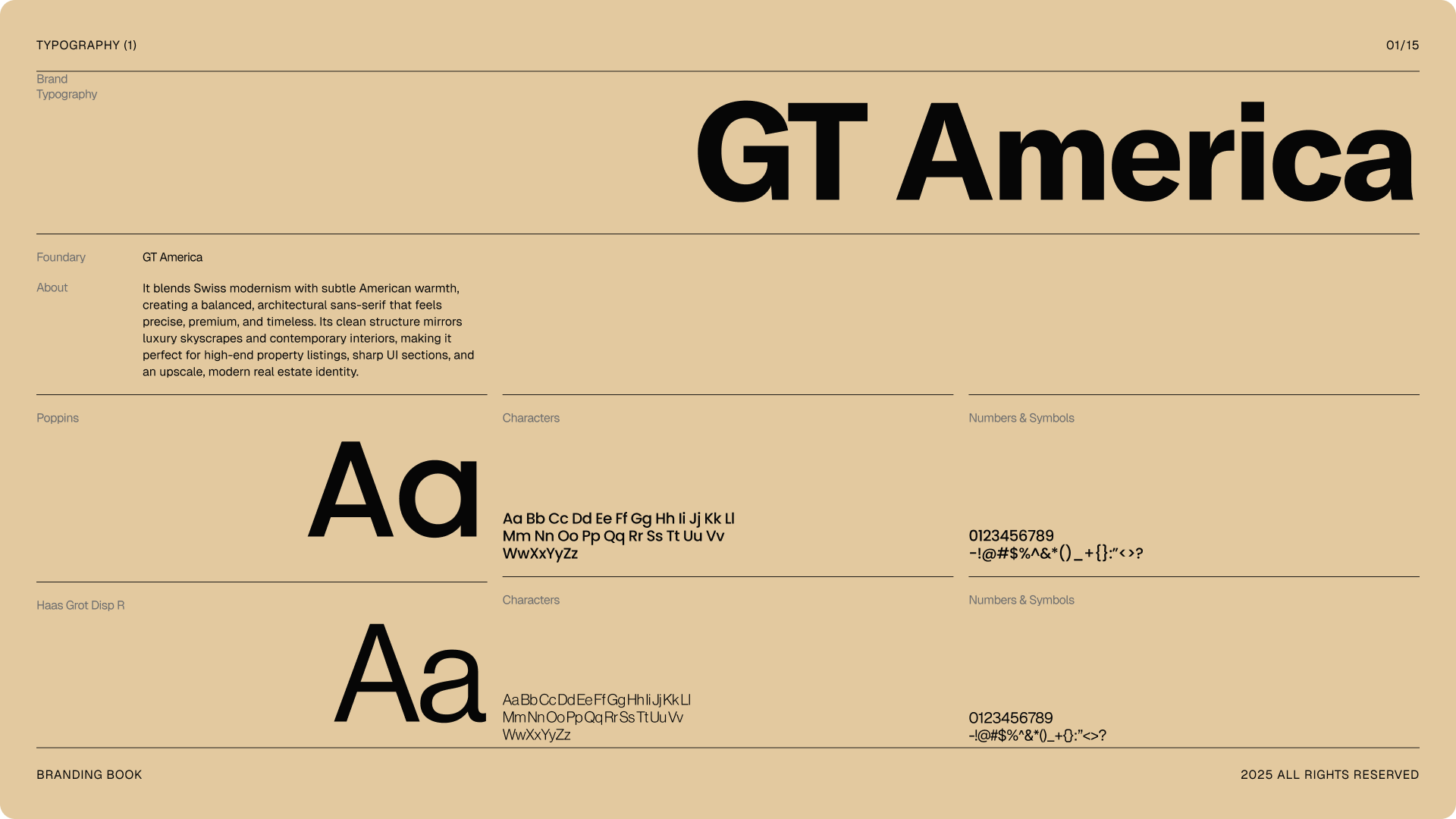
Typography:
Typography features bold, modern sans-serifs evoking urban prestige, paired with refined weights for hierarchy in case studies.
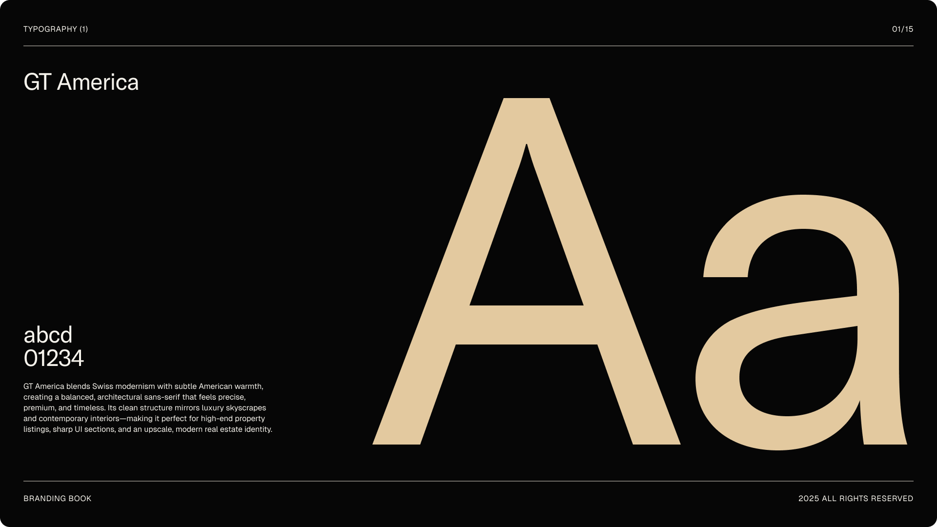
- Primary Font: GT America (or similar like Helvetica Neue Bold) – Headlines: 48-72pt, Bold.
- Secondary Font: Sans-serif (e.g., Inter or GT America Light) – Body: 16-20pt, Regular; Captions: 12pt.
- Rules: 1.5 line height, generous kerning for luxury spacing; left-aligned for readability.
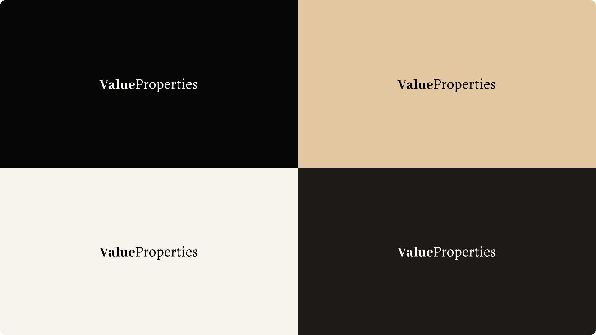
Logo & Graphics
Center the "Value Properties" logomark in gold on black for maximum impact, scalable from favicons to hero sections.
- Primary: Horizontal gold text on black rectangle.
- Variations: Monochrome white on beige; inverted gold on transparent.
- Clear space: Equal to logo height around all sides; minimum size 32px.
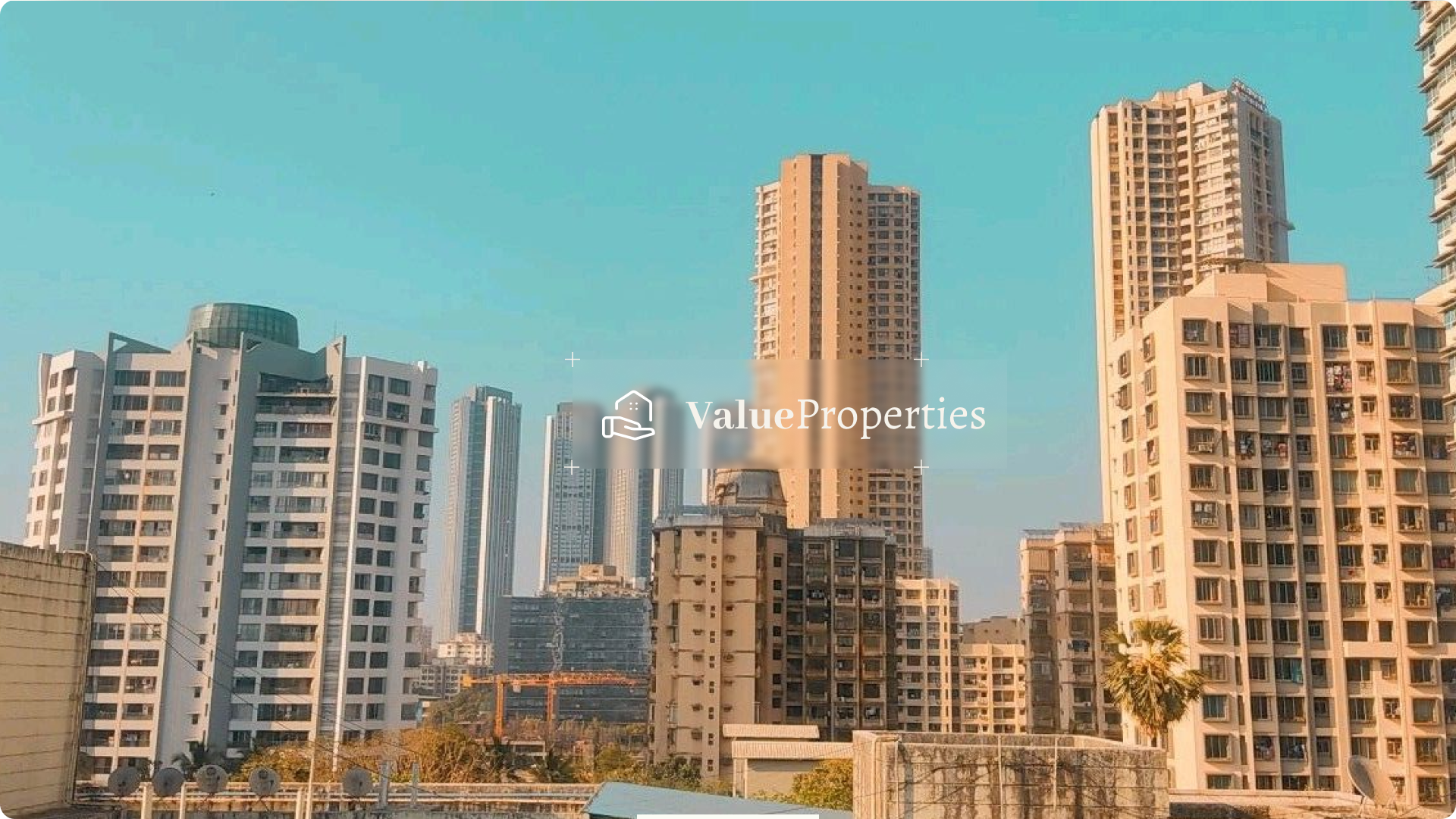
- Graphics: Full-width Mumbai skyline photos, minimalist icons, subtle gold lines.
Layout & Imagery
Adopt a grid-based, horizontal layout with ample white space to convey exclusivity, ideal for case study pages.
- Hero: Full-bleed property image with overlay title.
- Sections: 12-column grid; 16px gutters; photography of luxury high-rises in golden hour light.
- Case Study Flow: Problem-Solution-Results with before/after visuals.
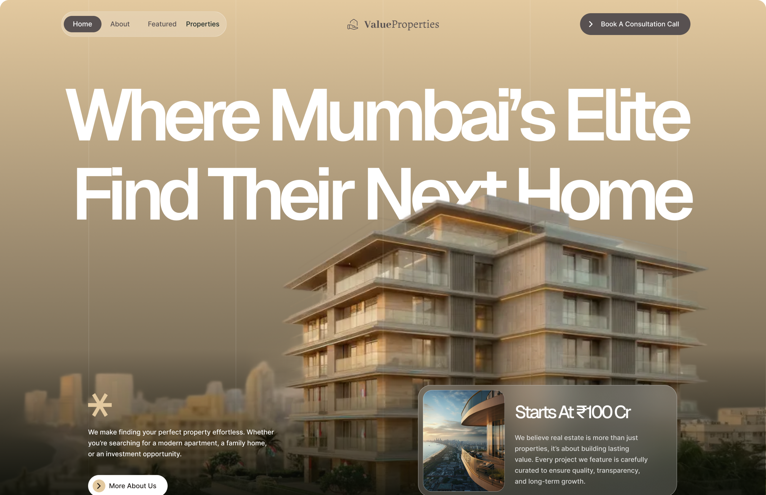
Hero & Landing
The hero and landing experience was designed to establish immediate trust and visual authority while guiding users through the brand without overwhelming them. A single high-quality luxury property visual sets the tone, followed by a clear content hierarchy that moves from brand positioning to curated properties and advisory value.
By limiting volume, emphasizing clarity, and using generous spacing, the experience feels refined and intentional attracting high-intent users and leading to higher-quality inquiries.
Curated Properties
The property listings were intentionally limited and curated to reinforce exclusivity. Instead of dense grids, properties are presented with clear hierarchy and generous spacing, helping users focus on quality rather than volume. This curation-driven approach improves decision confidence and attracts more serious, high-intent buyers.
Property Details
The property details page prioritizes clarity and trust. Information is structured to highlight architecture, location, and value without visual noise. By presenting only what matters, the page supports informed decision-making and reduces friction in high-value inquiries.
Contact Us
The contact page was designed as a private entry point, not a sales funnel. Minimal fields and a calm layout reinforce discretion and professionalism, encouraging serious users to initiate contact while filtering low-intent inquiries.
404 Page
The 404 page maintains brand consistency even in error states. Clean messaging and clear navigation help users recover gracefully, preserving trust and preventing drop-offs in the user journey.
Results & Outcomes
- Significant uplift in perceived brand value
- Higher‑quality, intent‑driven inquiries
- Improved engagement time on property pages
- Strong differentiation from mass‑market real estate platforms
Key Learning
In luxury real estate, design is not decoration it is signal. Clear hierarchy, restraint, and storytelling create trust long before a conversation begins.
"Designed to feel private, confident, and uncompromising just like the properties themselves."