BB's Backing – Website Redesign for Björn Büttner
Client: BB's Backing led by Björn Büttner is a Web services and software development business offering high-quality web hosting, performance optimization, technical SEO, consulting, and related services.
About the project
Björn’s existing website (bjoern-buettner.me) served its purpose but had a dated visual style and lacked modern design standards that maximize user engagement and conversion. The goal was to transform the site into a modern, premium, and conversion-focused experience, while keeping content and core messaging intact.
Problems
Before redesign:
- The website looked basic and utilitarian.
- Visual hierarchy and UX patterns were outdated for today’s web standards.
- Call-to-action elements (like contact, bookings, and services) weren’t optimized for clear conversion paths.
- The site did not reflect the premium quality of Björn’s services.
Our Objectives
We adopted a luxury‑first, experience‑led design methodology, inspired by high‑end hospitality, fashion, and private banking rather than traditional property portals.
- Modernize the visual identity: Bring a professional look that feels premium and trustworthy.
- Improve conversion paths: Guide visitors toward key actions service discovery, booking consultations, and contact requests.
- Enhance user experience (UX): Use layout, typography, and content structure that make navigation intuitive and engaging.
- Deliver strategic options: Provide two distinct design variants so the client could choose and iterate adding value beyond the basic scope.
Our Approach
We adopted a luxury‑first, experience‑led design methodology, inspired by high‑end hospitality, fashion, and private banking rather than traditional property portals.
Research & Strategy
- Analyzed the current website structure, messaging, and services offered.
- Identified core user actions (e.g., booking a service, requesting a quote, contacting support).
- Reviewed industry leaders in web services to inform premium design patterns.
UX & Conversion Strategy
- Prioritized content hierarchy: Hero → Services → Social proof → Clear CTAs → Contact.
- Placed strategic CTAs in high-visibility locations (top nav, hero section, service sections).
- Streamlined navigation to reduce overwhelm and highlight value offerings.
Visual Redesign - Two Variants
Going beyond the brief, we presented two professional design concepts to introduce strategic flexibility and ensure stronger alignment with the client’s goals. Each direction was intentionally differentiated to serve a distinct strategic purpose.
-
Variant A: Premium & Minimal
- Clean typography with a refined color palette.
- Strong visual hierarchy focused on clarity and trust.
- Elegant spacing and imagery to enhance perceived value.
-
Variant B: Conversion-Focused & Dynamic
- Bold CTAs with action-oriented language.
- Engaging UI elements (cards, interactive hovers) to guide exploration.
- UX focused on guiding user journeys toward Bookings and Contact pages.
Key Design Solutions
The design solutions focused on elevating the brand experience while ensuring usability for high-value users.
- Modern aesthetics - moved away from rigid grid-based listings to a more fluid, premium layout.
- Conversion paths - clear, intuitive routes to action supported by distinct CTAs.
- Responsive UX - optimized layouts for seamless performance across desktop and mobile.
- Improved service discovery - visually differentiated service blocks for faster scanning.
- Enhanced trust signals - testimonials, clear contact options, and social links to build credibility.
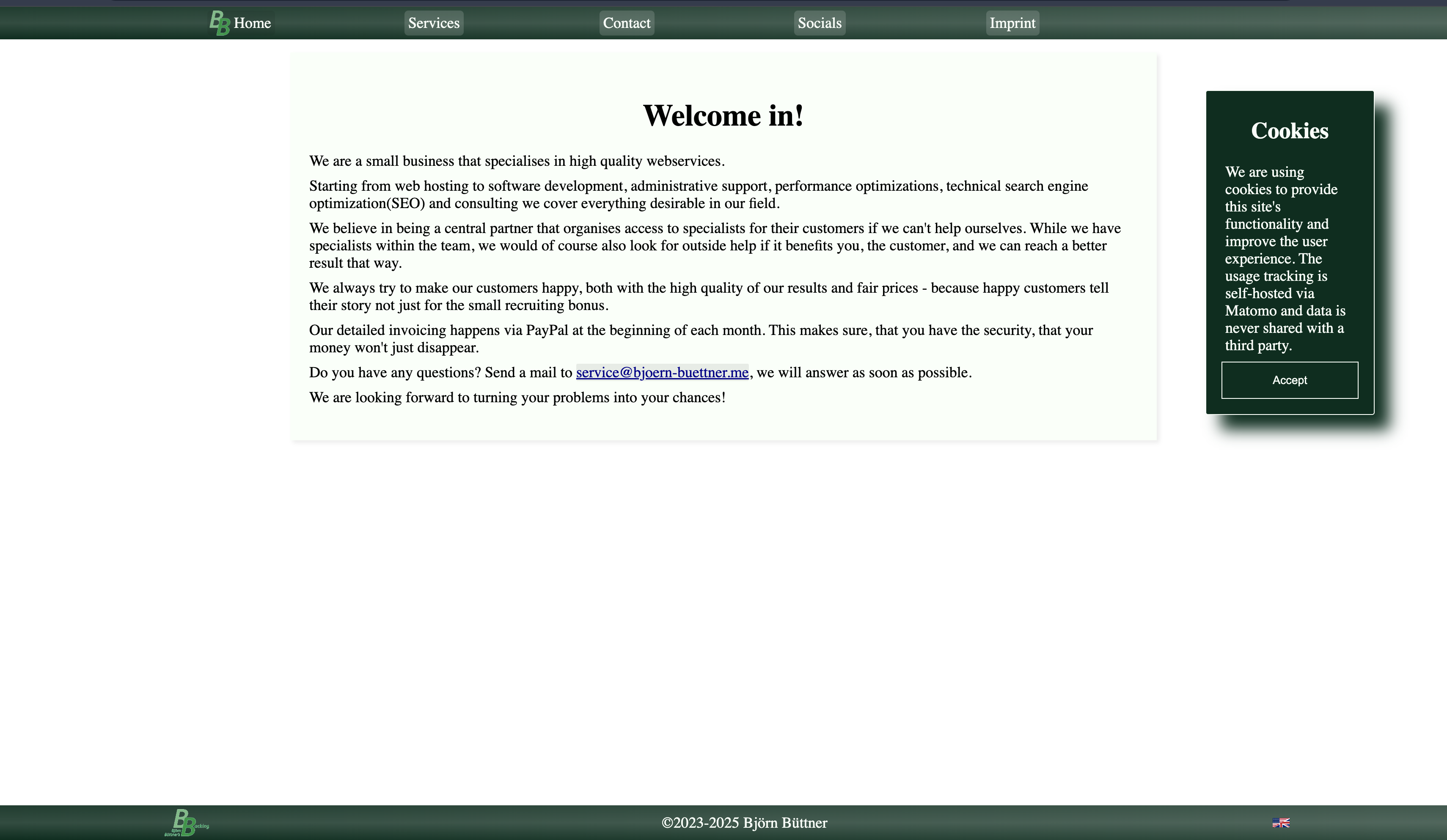
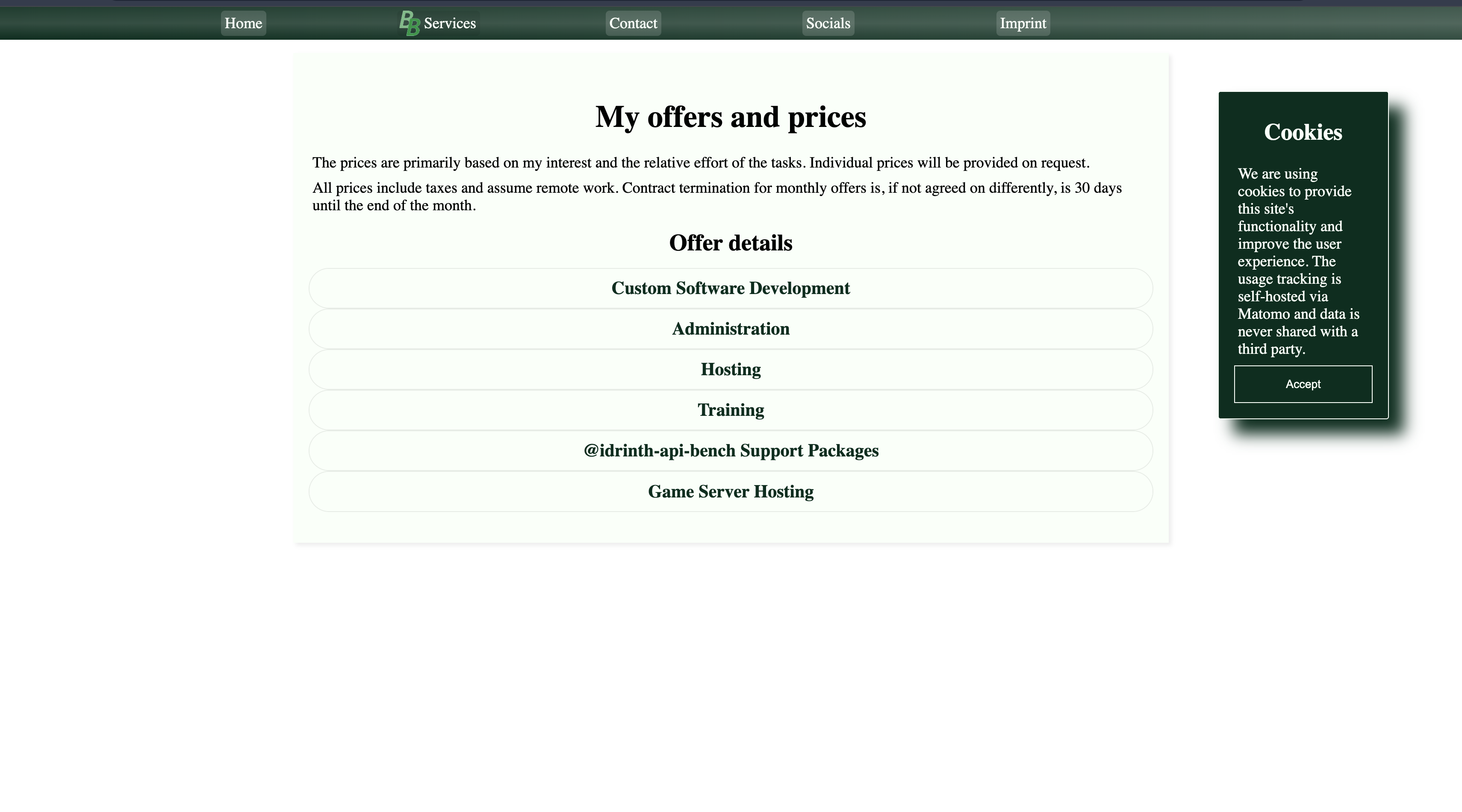
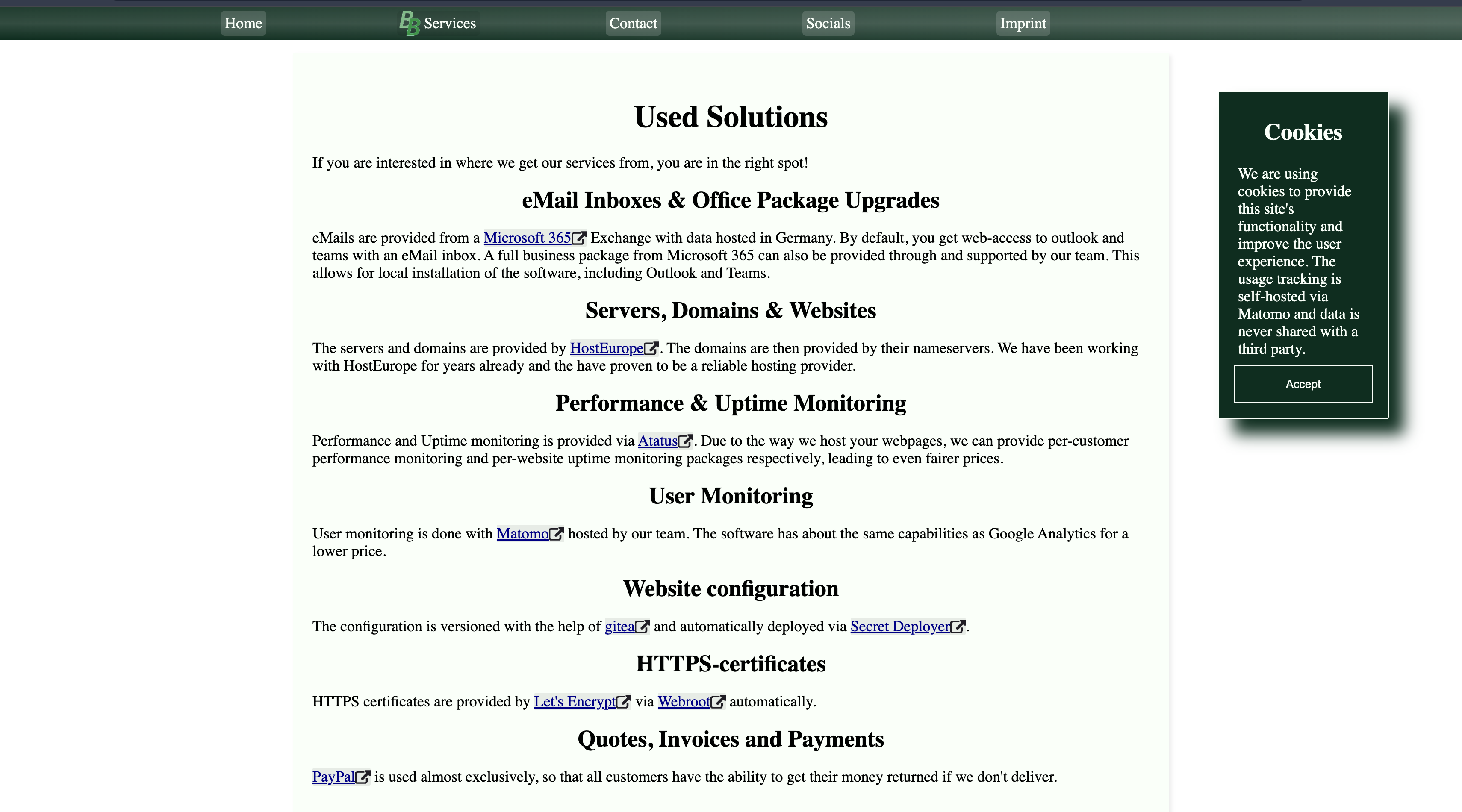
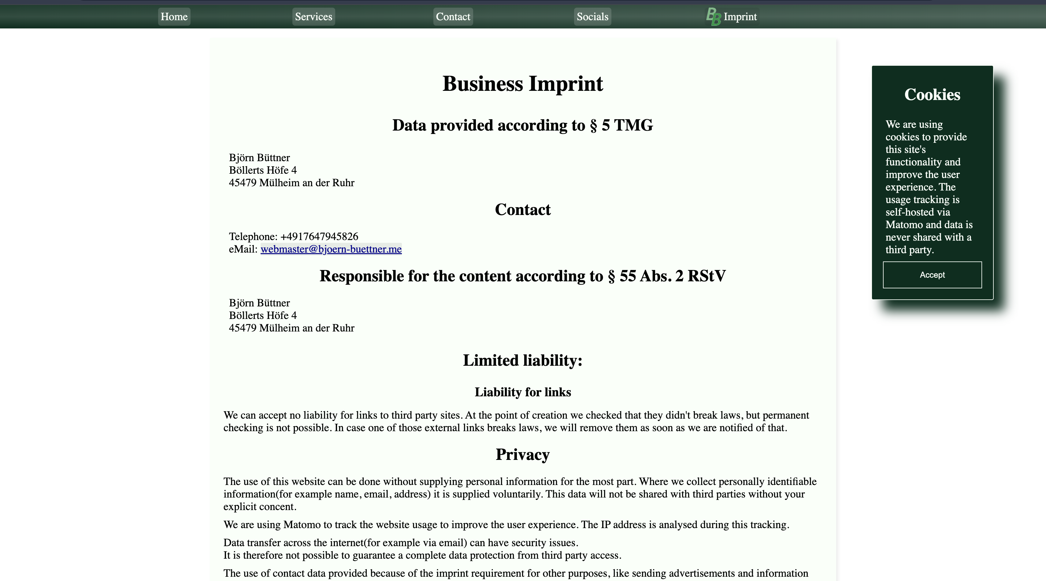
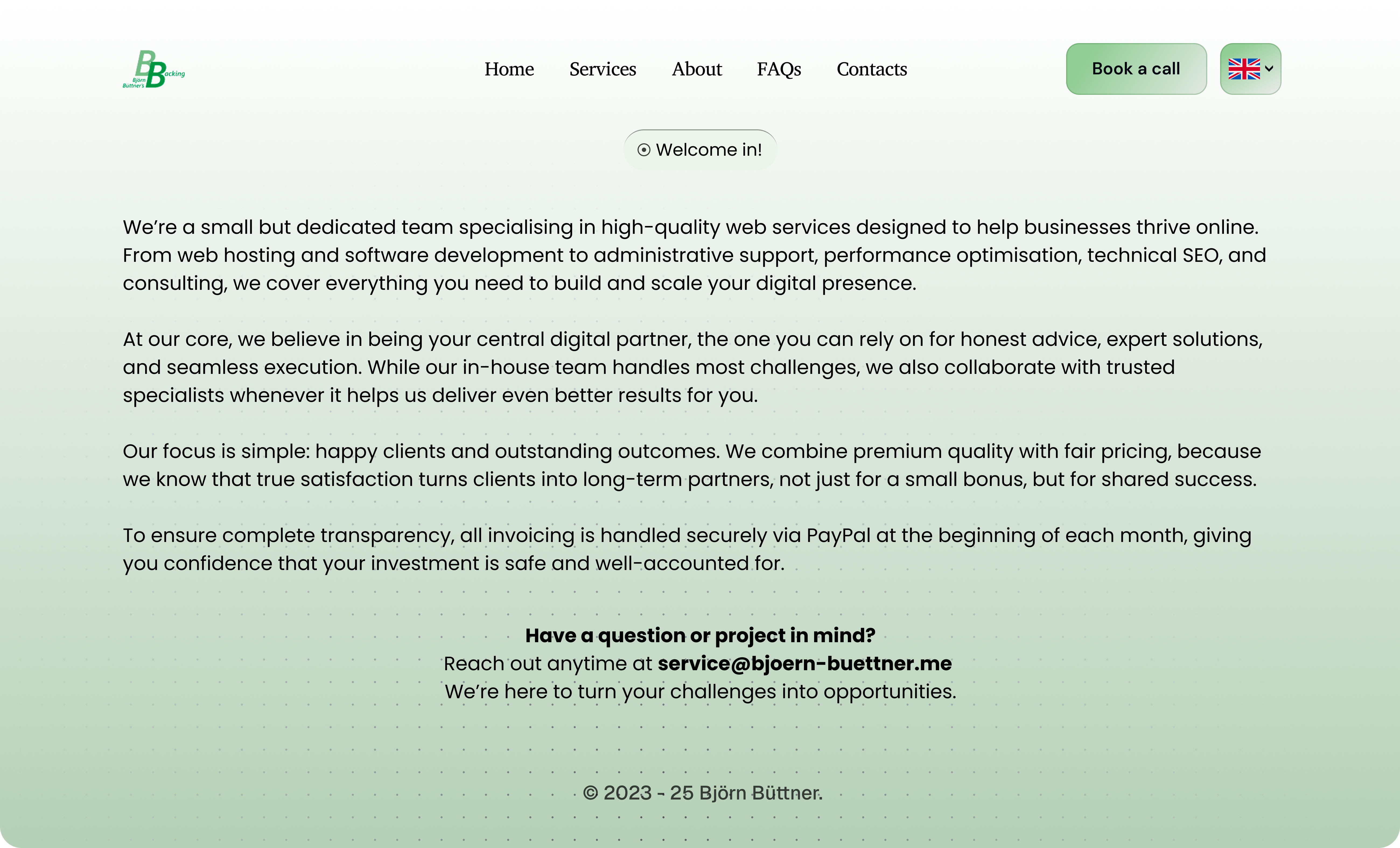
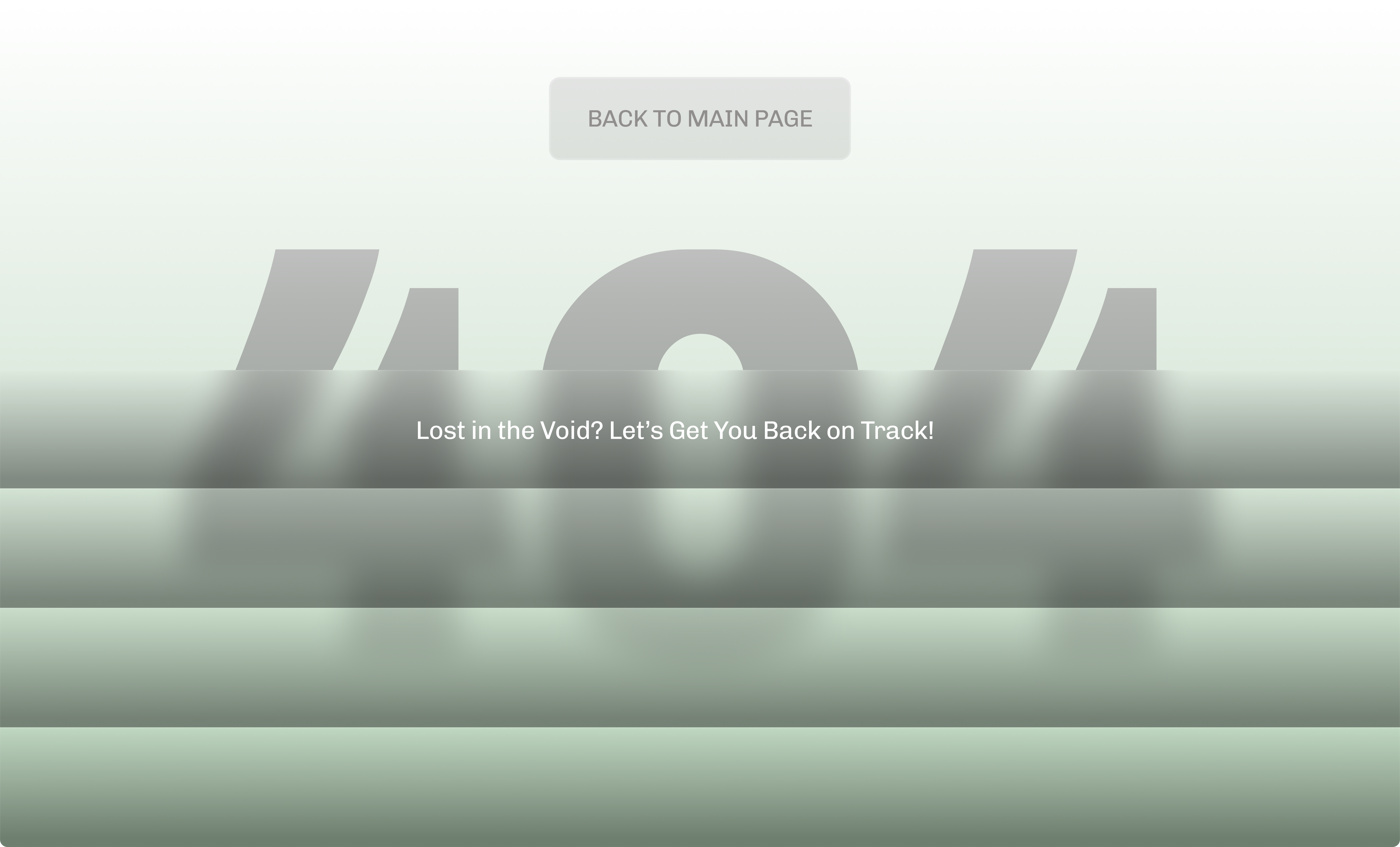
The Old Look of the Website
The previous website was technically sound but visually dated. While it communicated information, it lacked a strong visual hierarchy, modern design language, and clear conversion paths. The overall experience didn’t reflect the premium quality of the services offered, nor did it effectively guide users toward key actions like inquiries or consultations.
Before: Functional, But Falling Short:
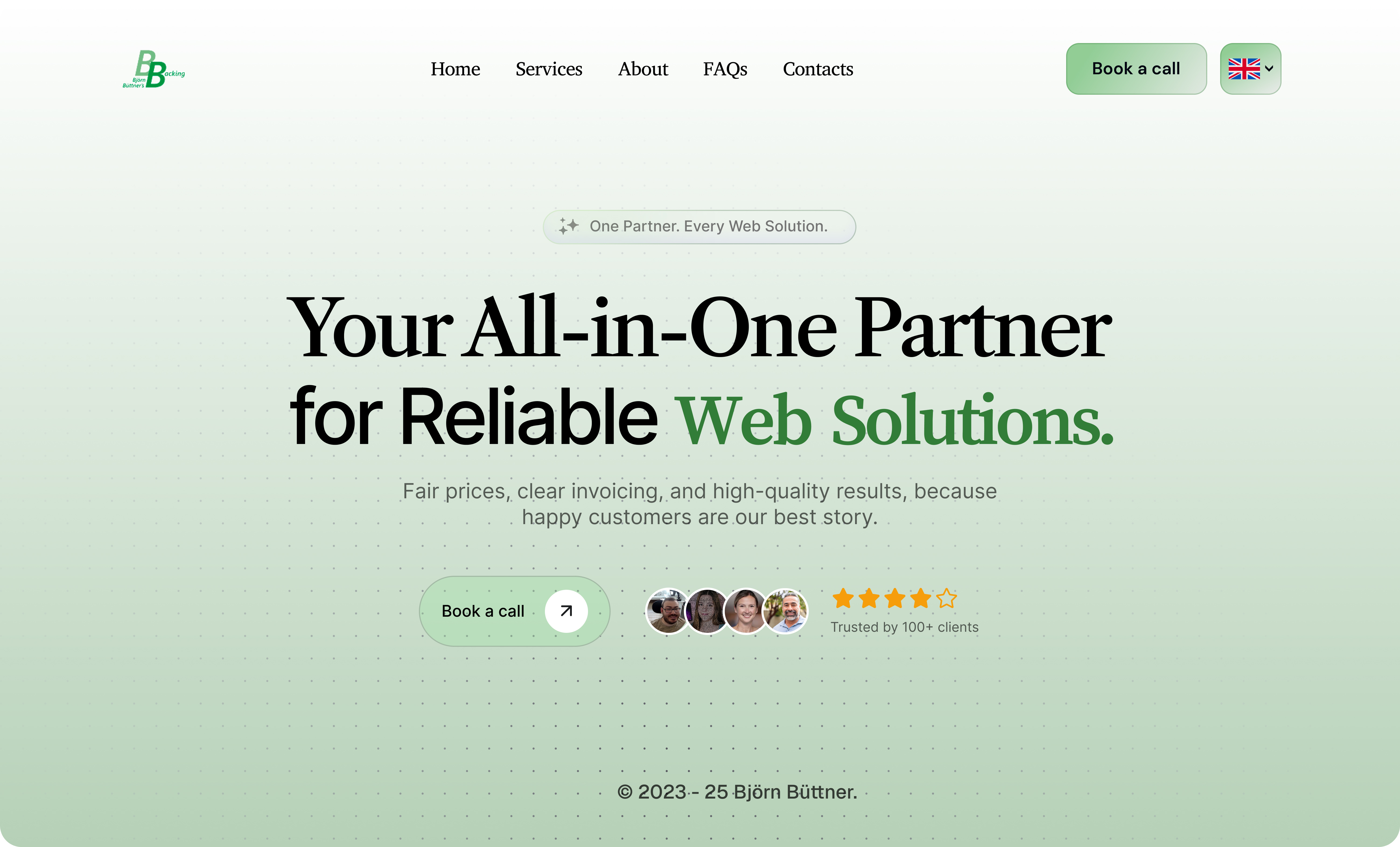
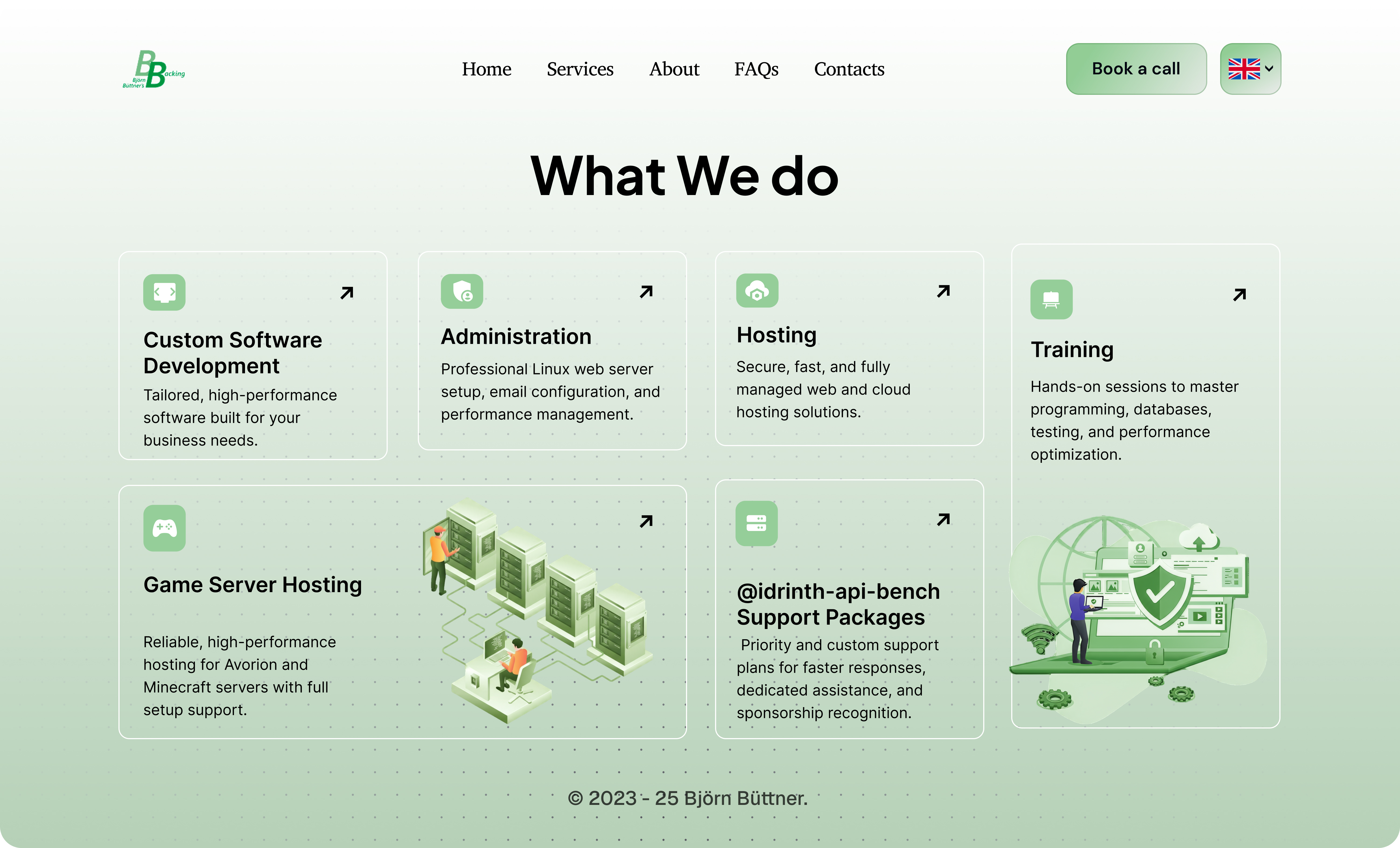
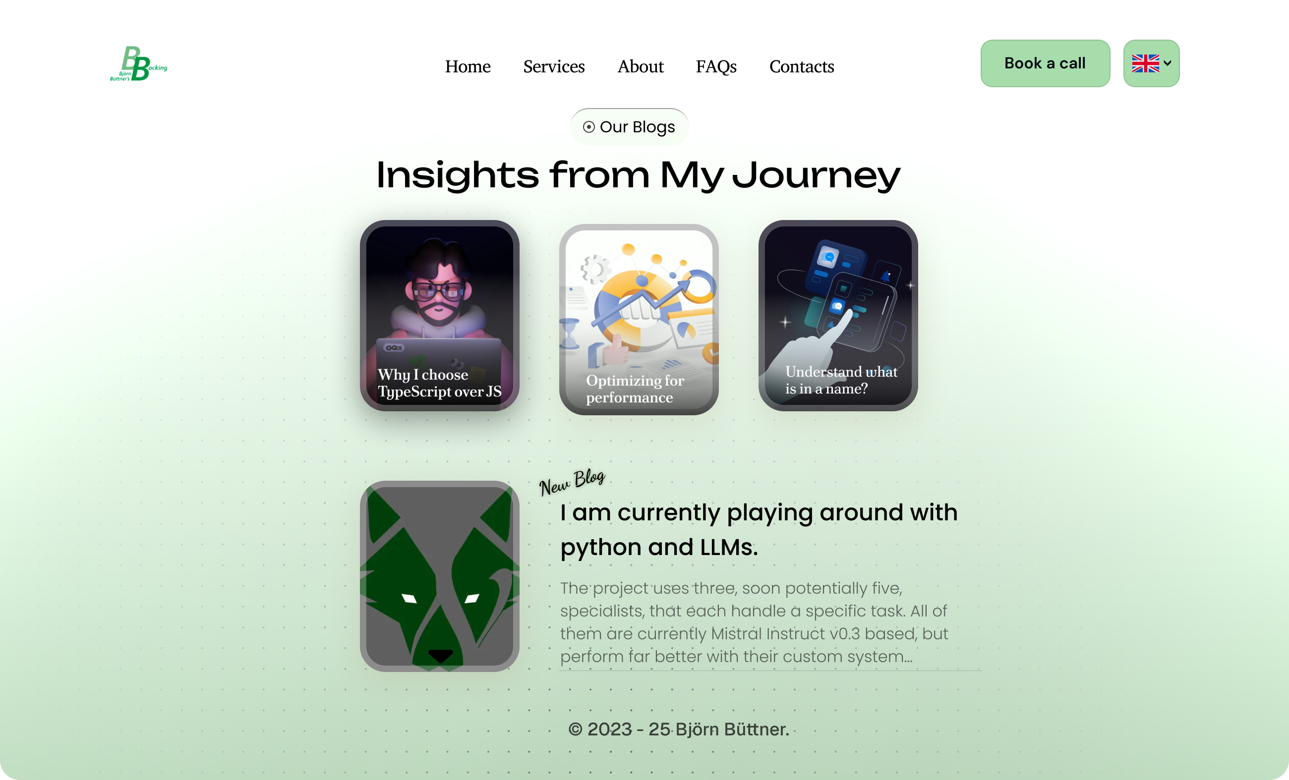
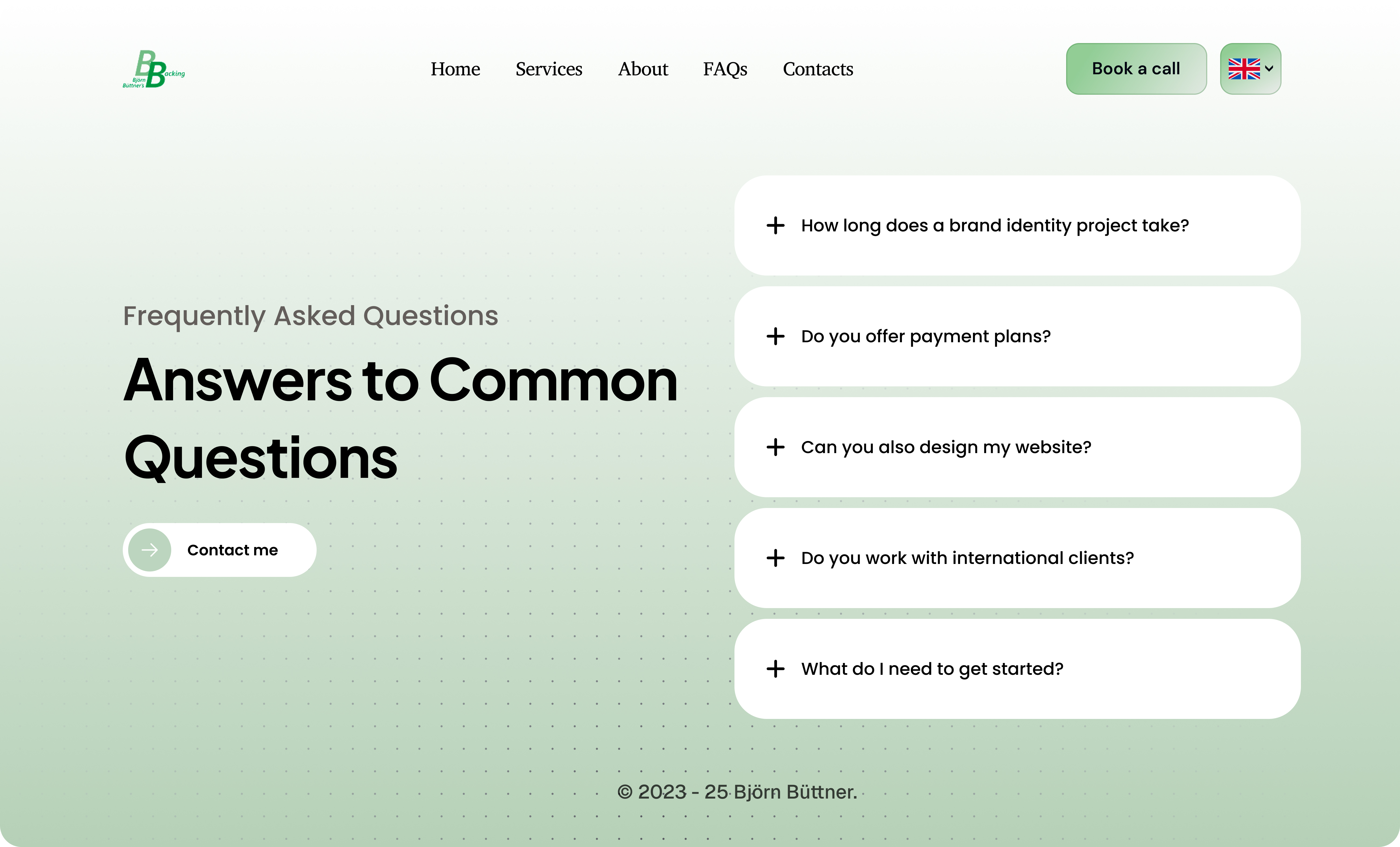
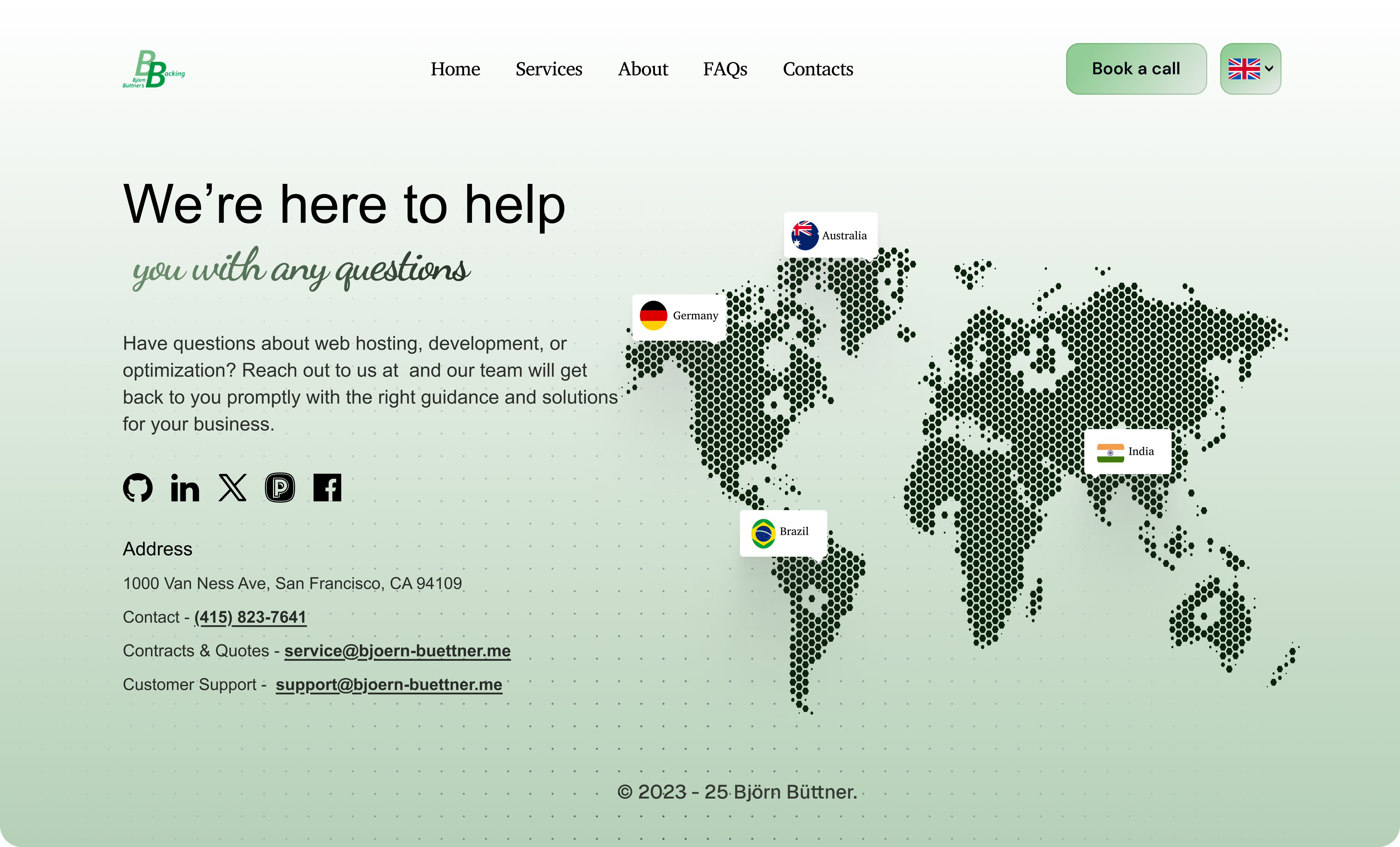
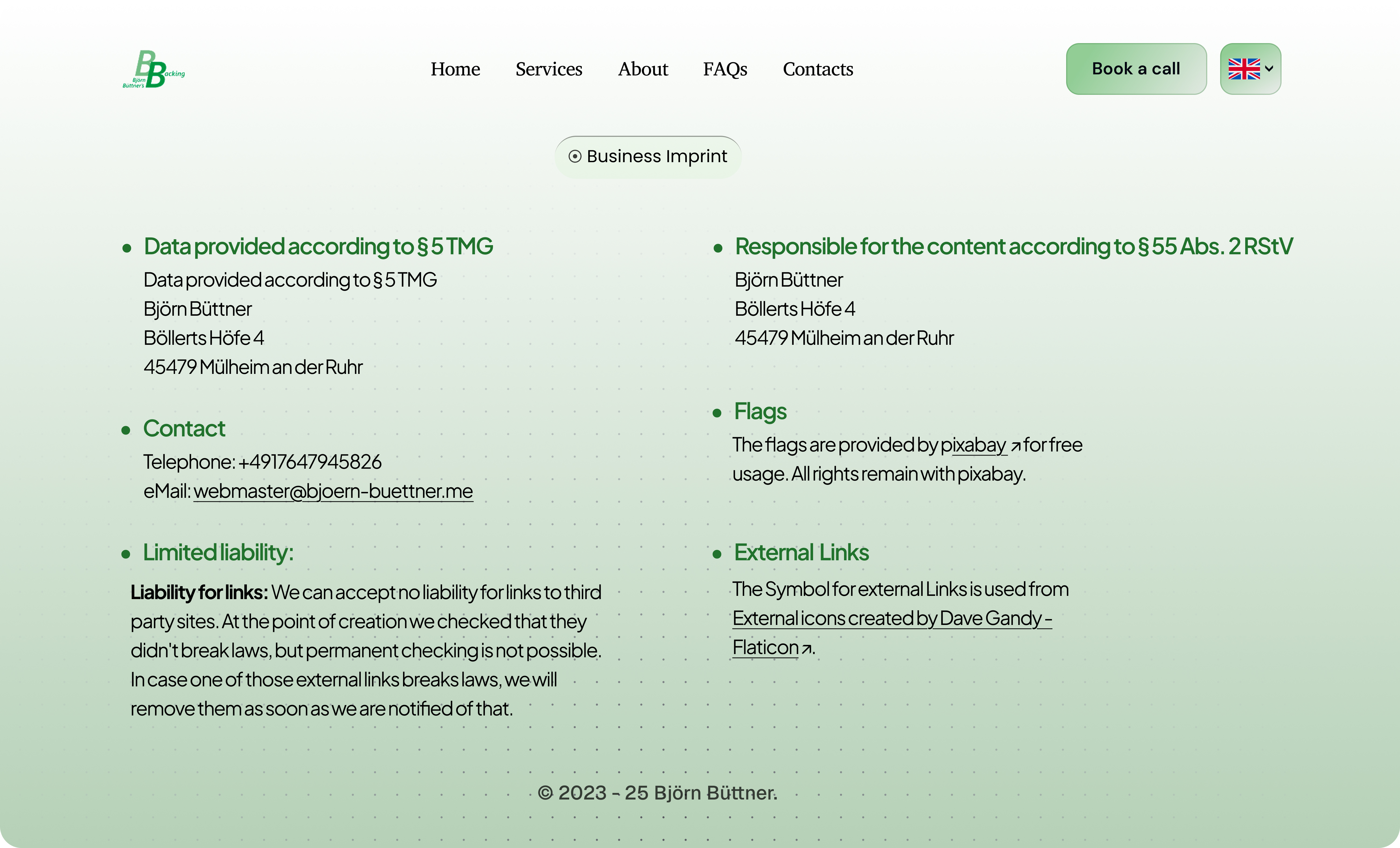
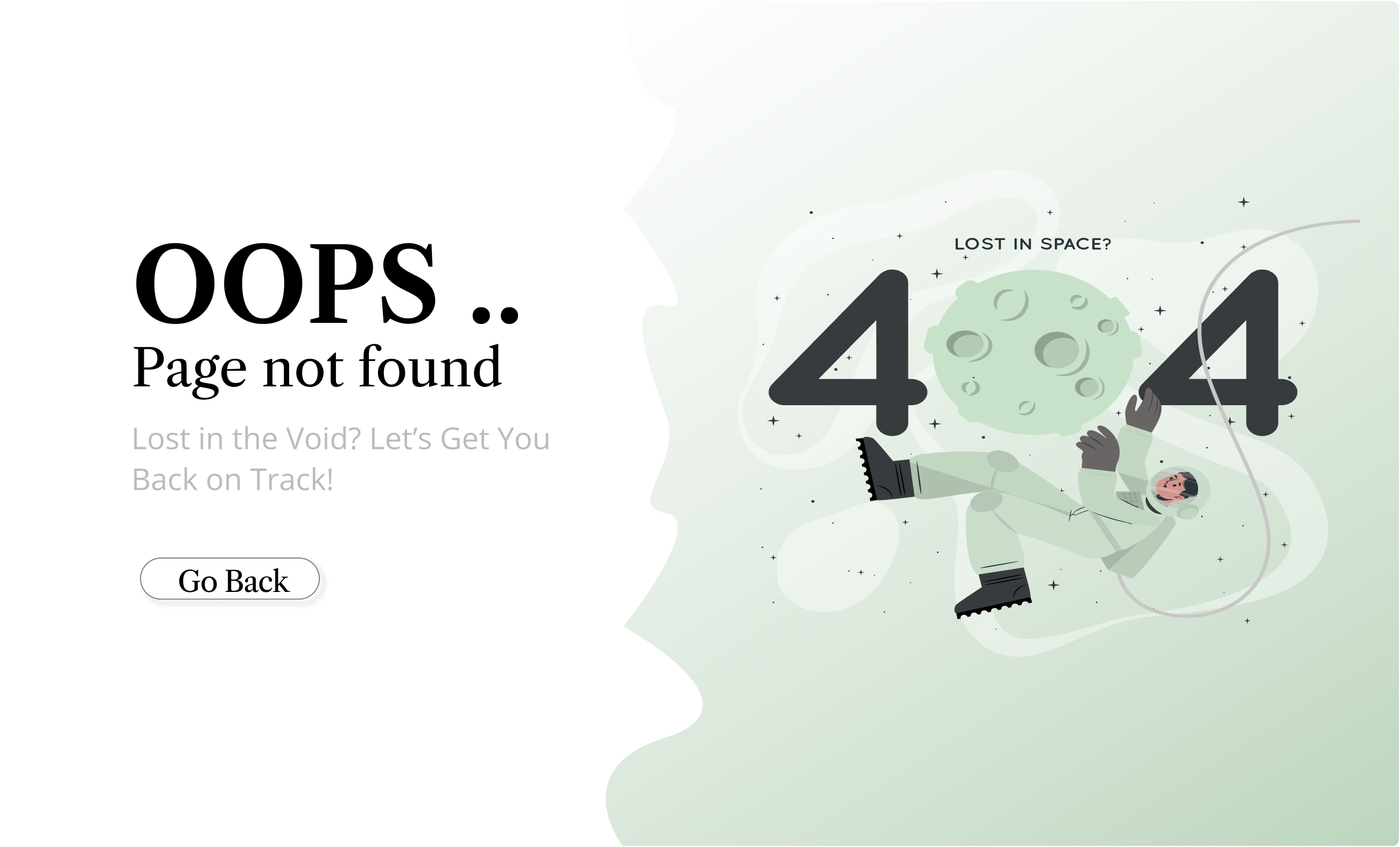
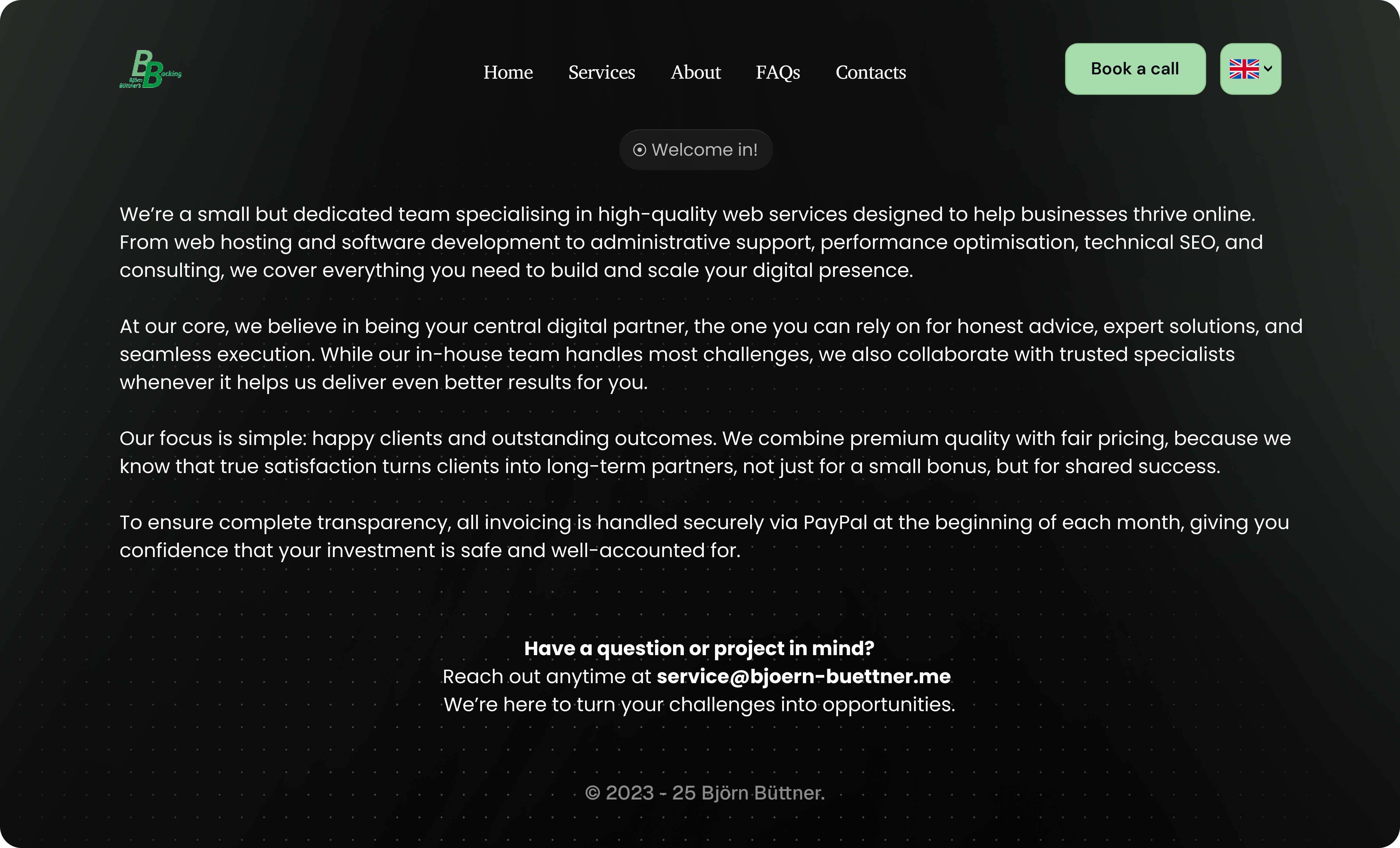
After: Modern, Clean & Conversion-Ready (Light Mode)
The new light-mode design introduces a clean, modern visual system with better typography, spacing, and hierarchy. It feels more premium and professional while guiding users clearly toward key actions through focused CTAs and improved layout flow.
.jpg)
.jpg)
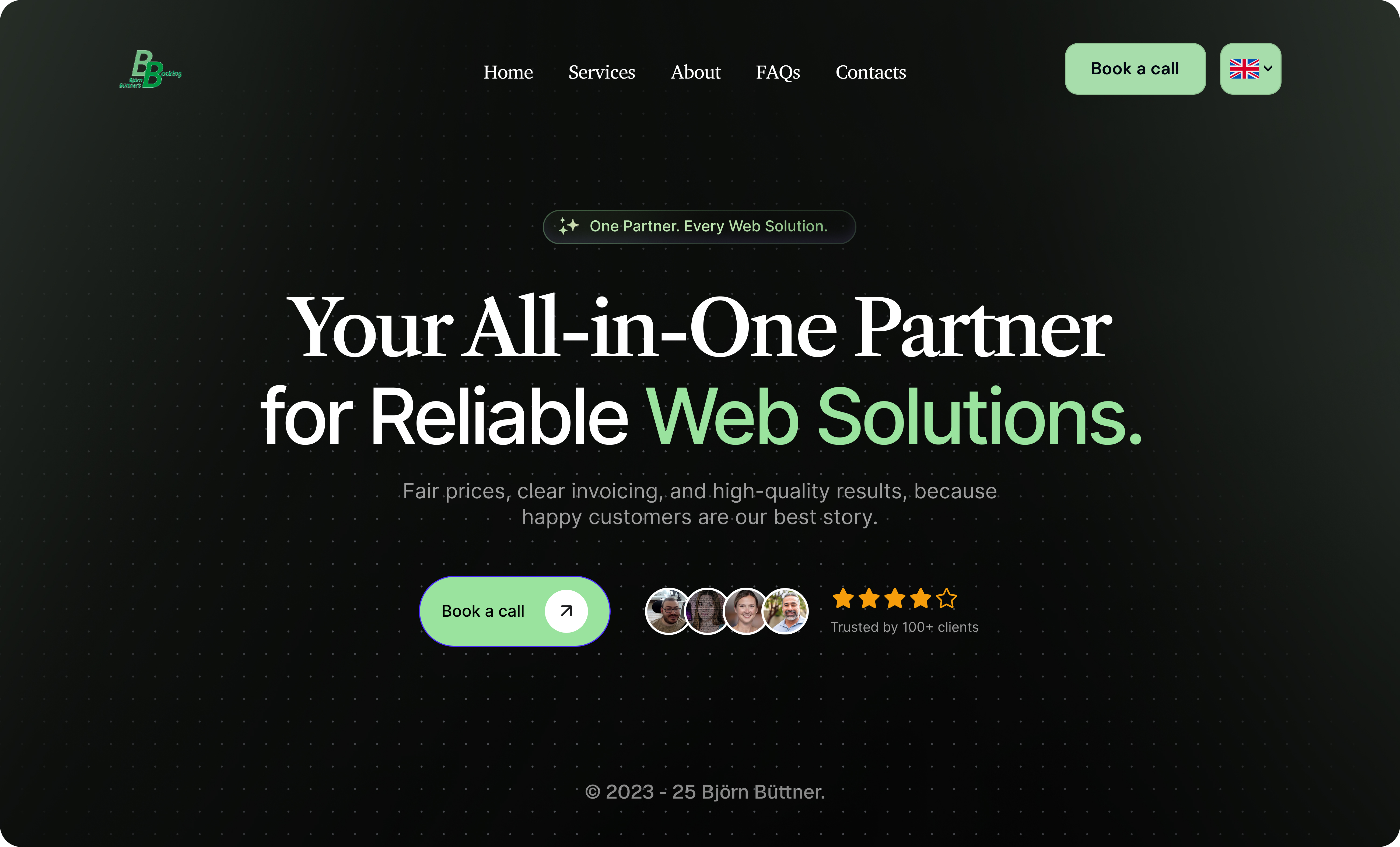
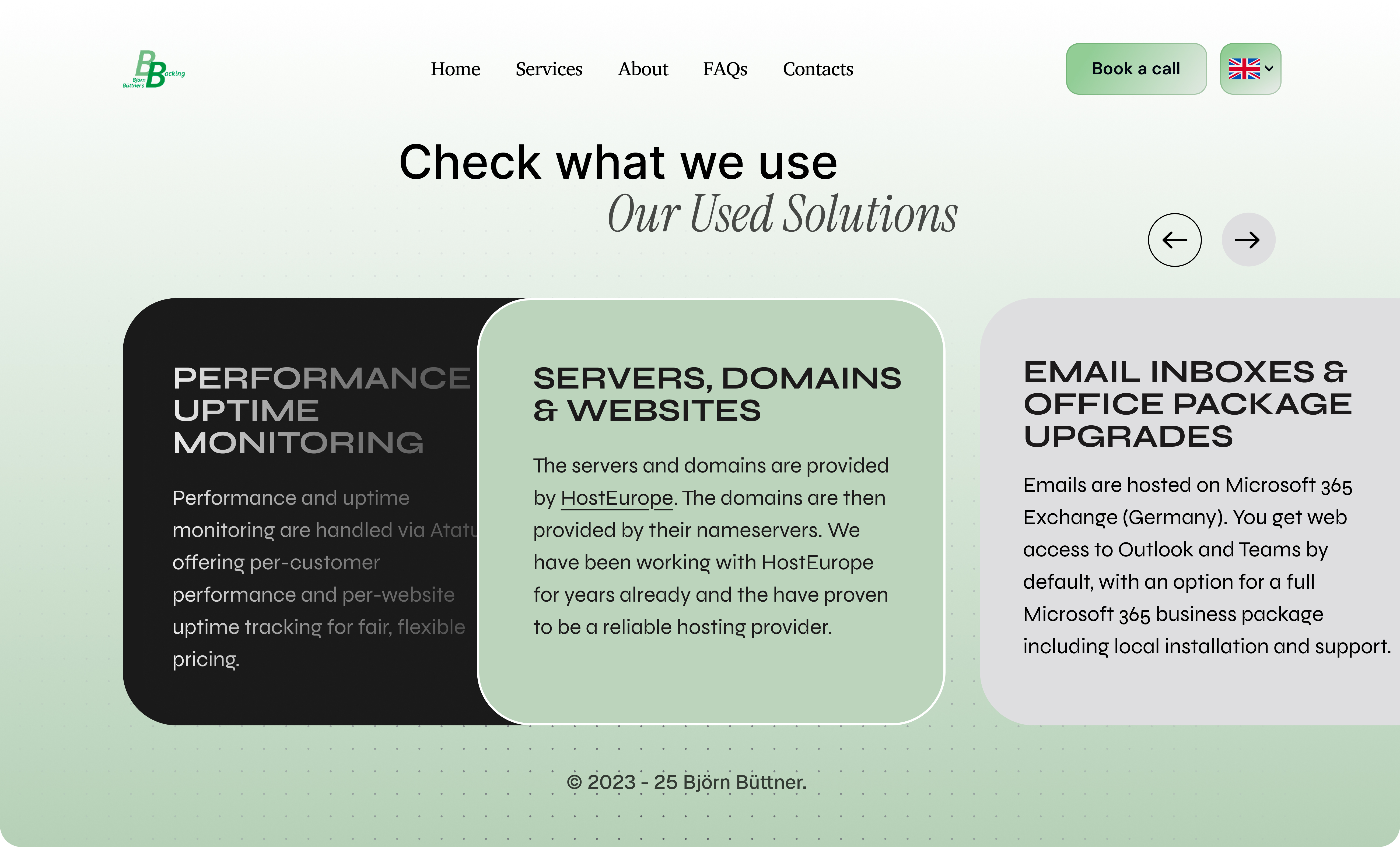
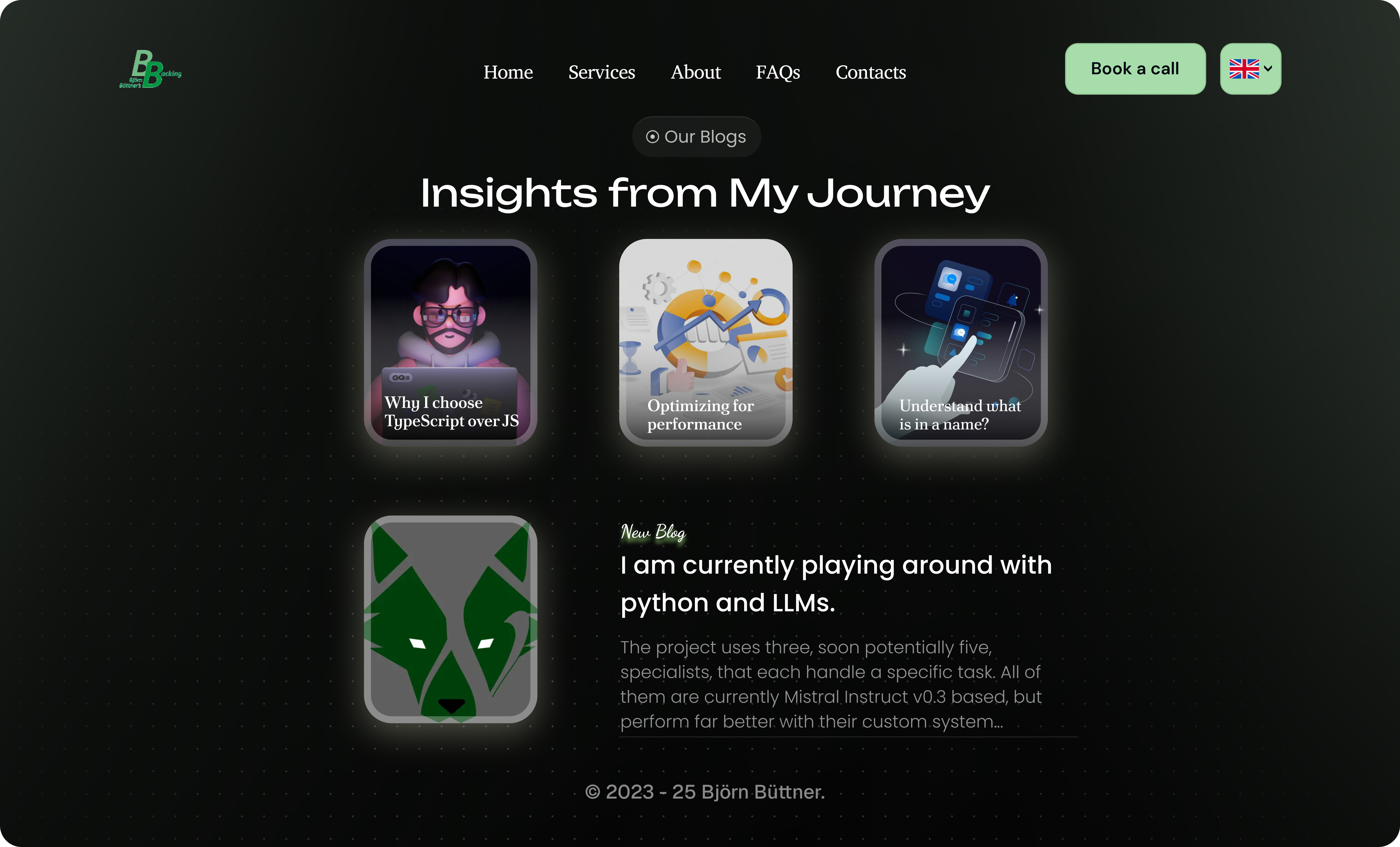
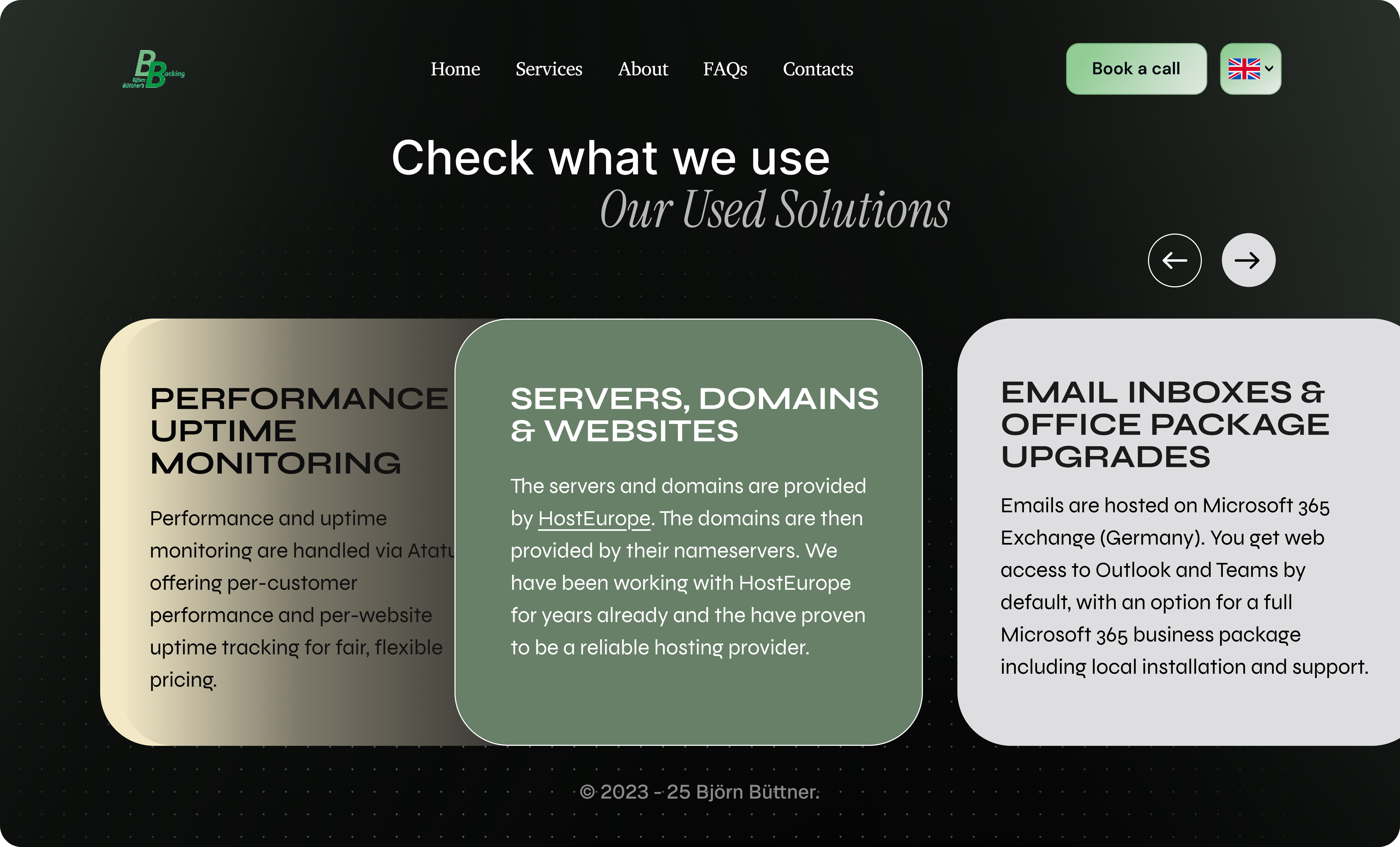
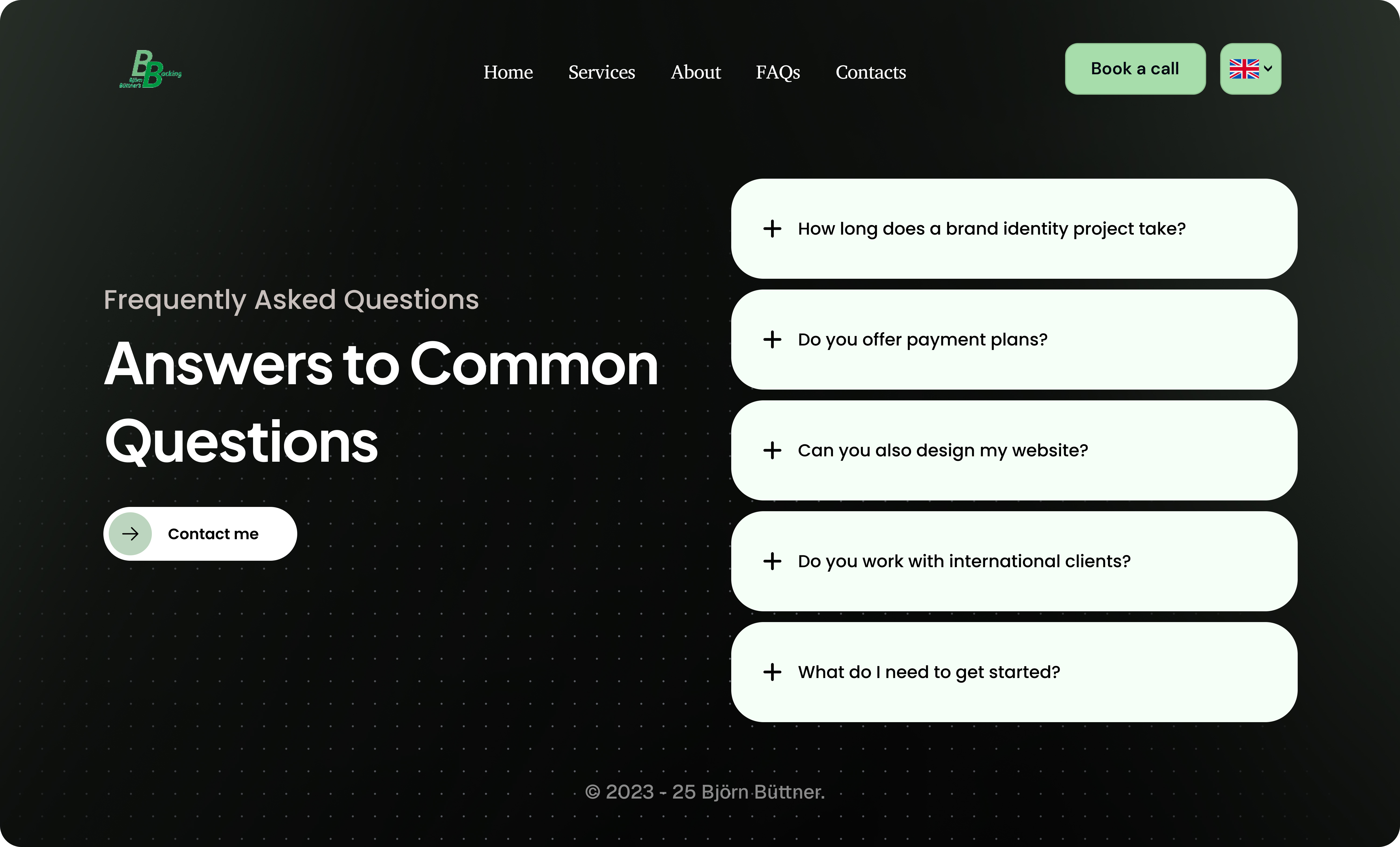
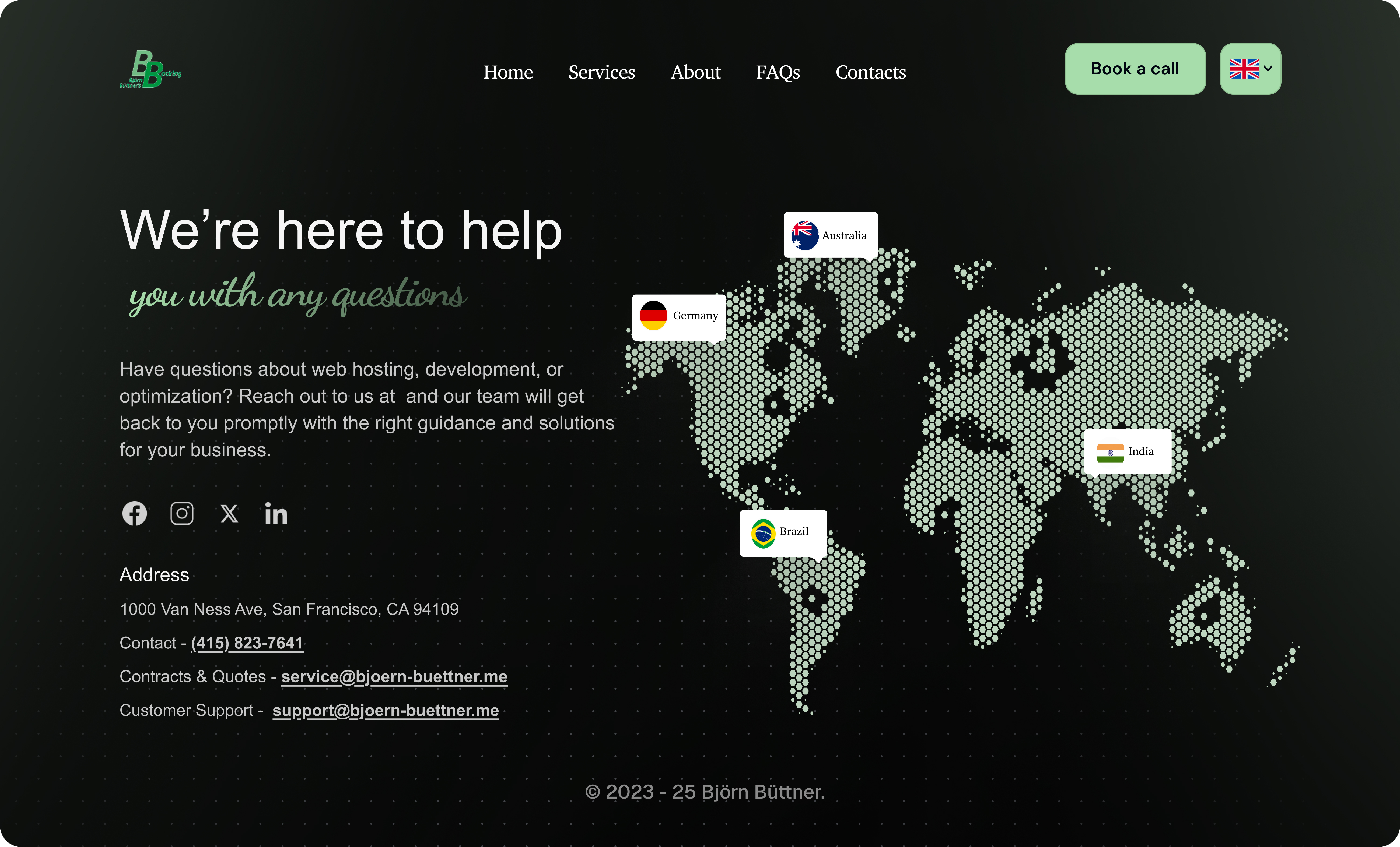
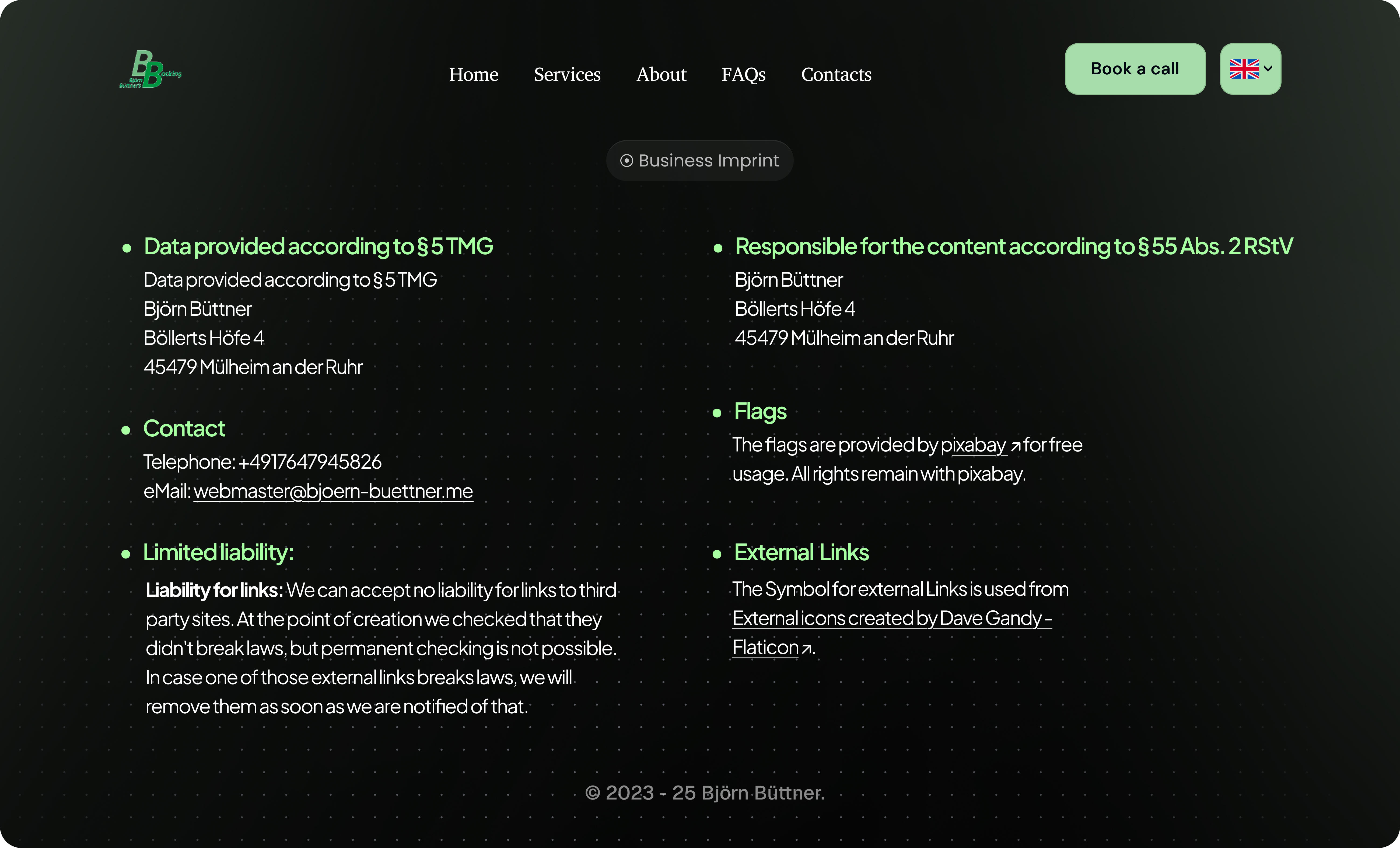
After: Bold, Premium & High-Impact (Dark Mode)
The dark-mode version delivers a bold, high-contrast experience with a premium feel. It enhances focus, elevates visual depth, and highlights key content and CTAs—creating a modern, confident interface designed to engage and convert.

.jpg)
.jpg)
Outcome & Impact
While performance data and analytics are not yet available (due to the recent or upcoming site relaunch), the redesign delivered measurable qualitative improvements:
- Strengthened visual professionalism and established a more modern, premium feel.
- Aligned design decisions with key business objectives, making conversions more intuitive.
- Improved user journey clarity through purposeful content hierarchy and a refined CTA strategy.
Additionally, the inclusion of a second design variant provided strategic flexibility, enabling the client to choose a direction that best aligns with their brand personality and conversion priorities.
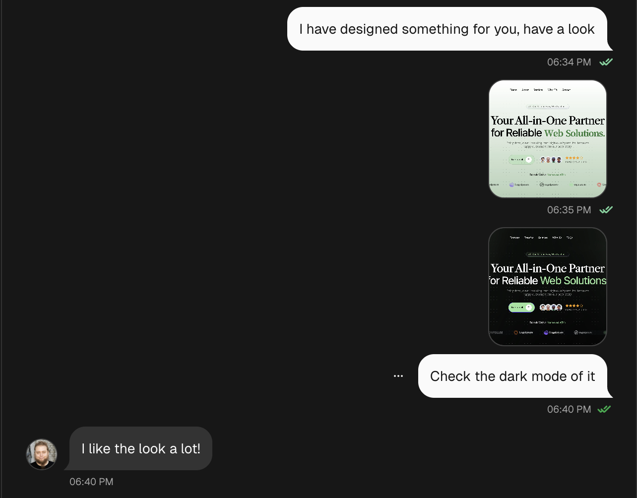
The client responded very positively to the redesign, appreciating the modern direction, attention to detail, and the added value delivered beyond the original scope.