CrestFly
Scope
Client
CrestFly
Year
2026
The Challenge
Look at the travel space—it's extremely noisy, and honestly, every brand looks exactly the same. CrestFly had an incredible product, but their branding was putting people to sleep. They needed a jolt of energy. Our job was to strip off the stiff corporate suit and give them a vibrant, fast, and relentlessly modern identity without sacrificing an ounce of trust.
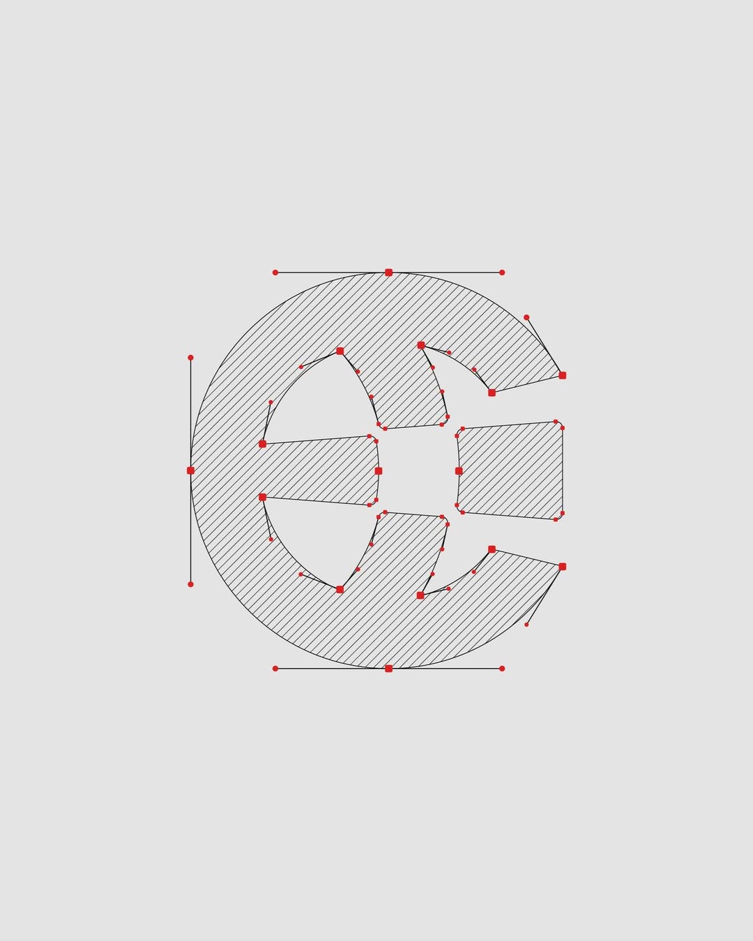
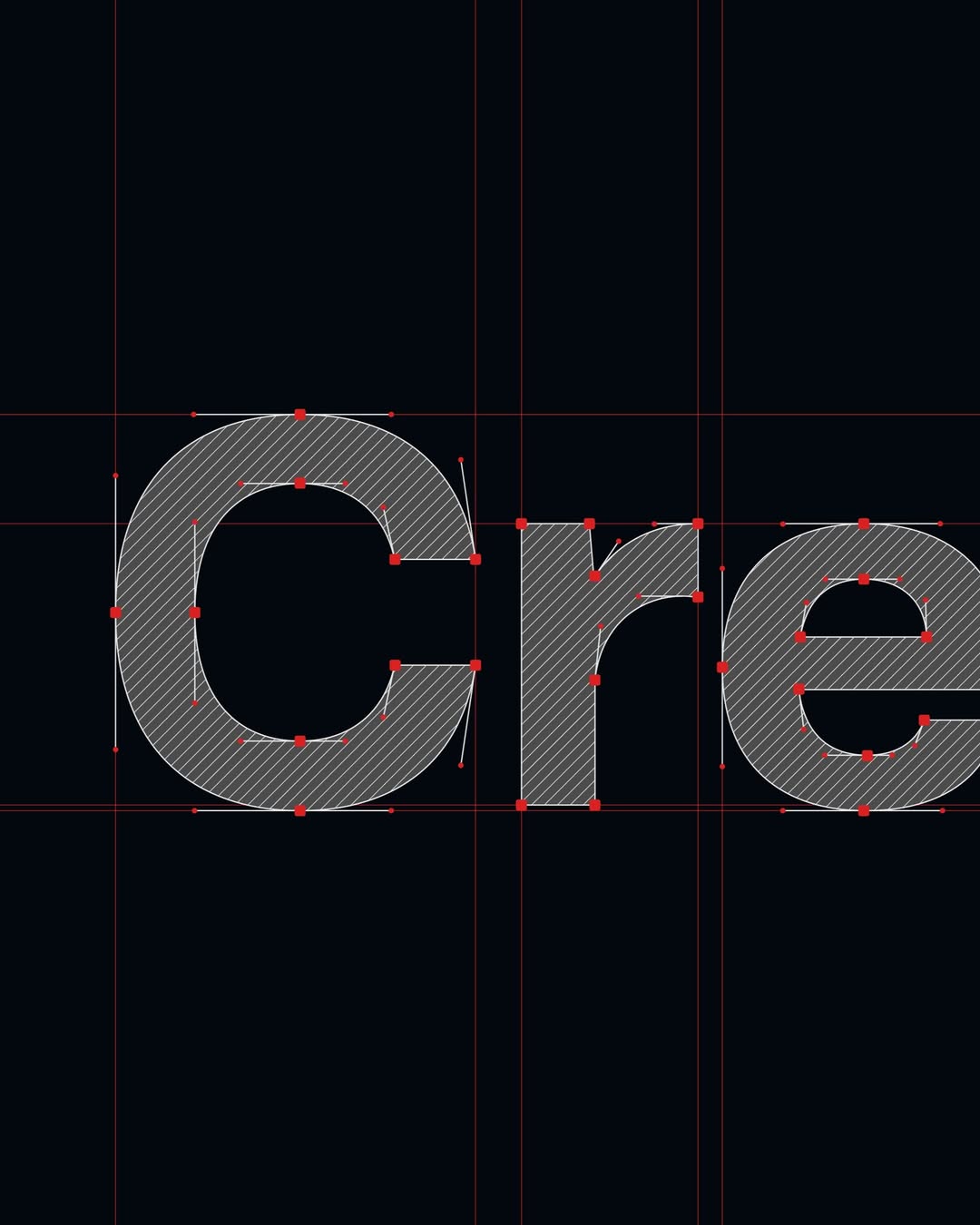
Visual Architecture
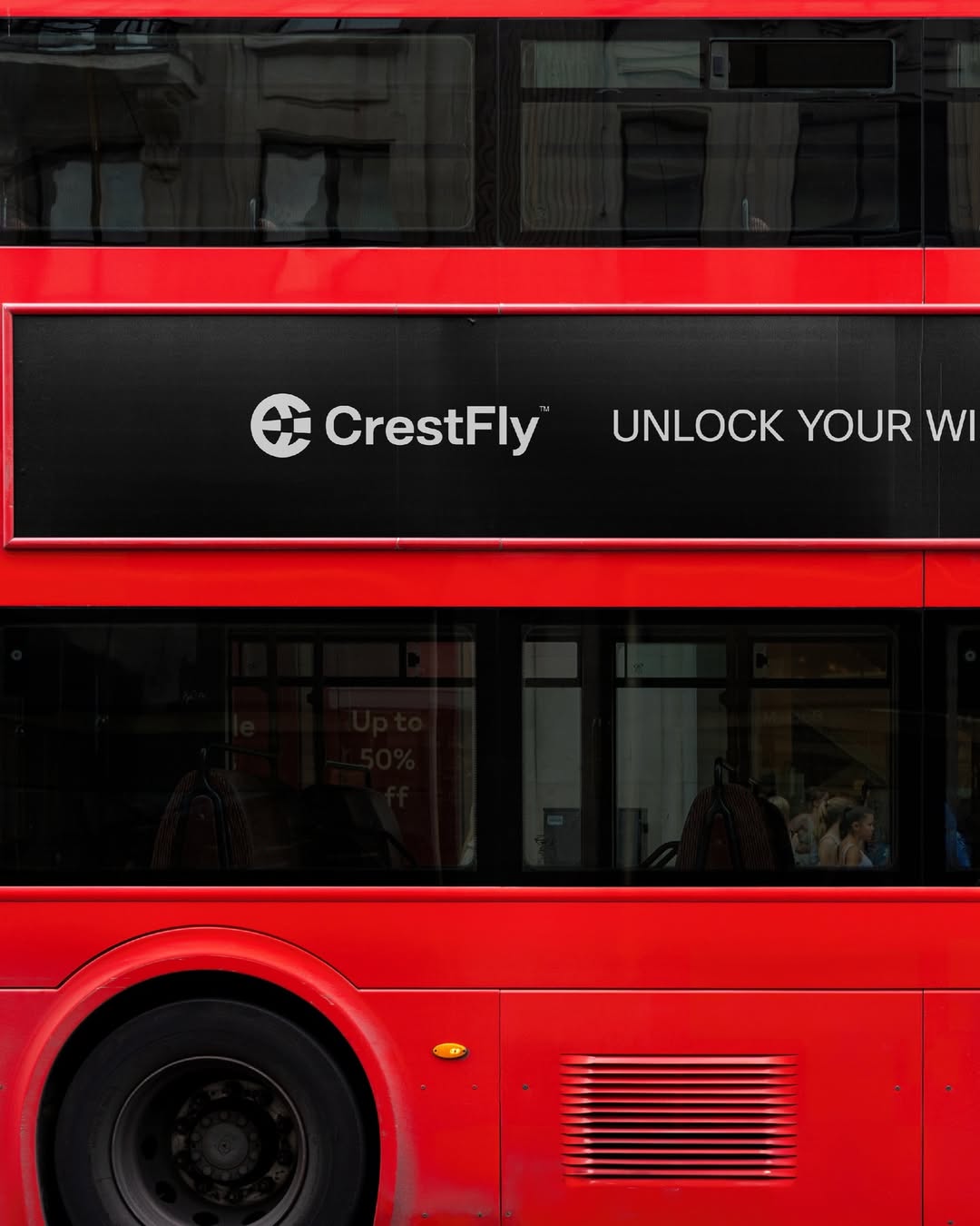
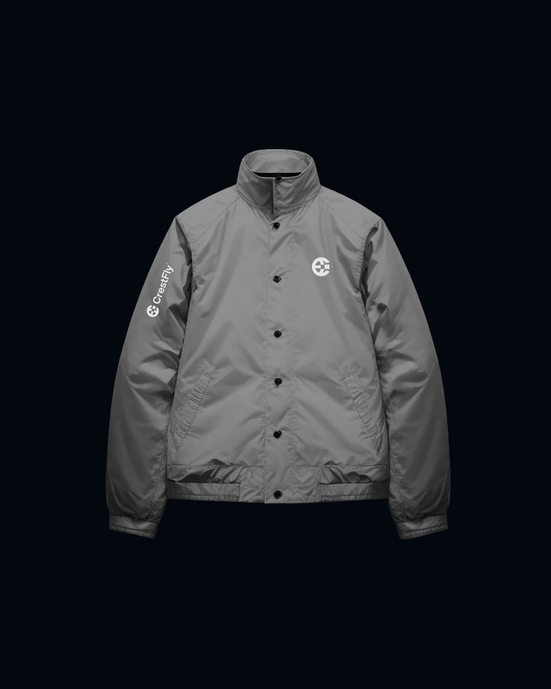
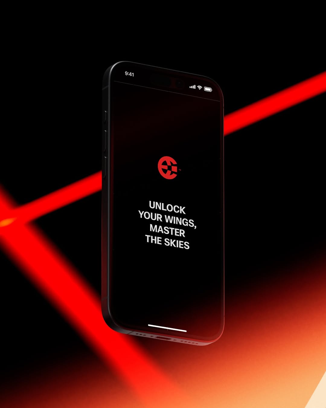
We threw out the idea of a standard, static logo. Instead, we built the mark around pure motion—acting less like a traditional stamp and more like a dynamic interface element. We paired this kinetic logomark with a bright, high-contrast palette, pushing deep primary accents to construct a UI ecosystem that feels instantly recognizable on a screen.
The Result
We tore it down to the studs to build an aerodynamic brand architecture. By pairing a sharp, minimalist icon with a seriously magnetic color palette, CrestFly finally looks like the premium booking platform they actually are. They walked away with a bulletproof visual toolkit ready to scale hard.