BB's Backing
Björn Büttner had the expertise. His website didn't show it. We rebuilt it from the ground up - two directions, one clear goal: make the site as good as the work.

The Brief
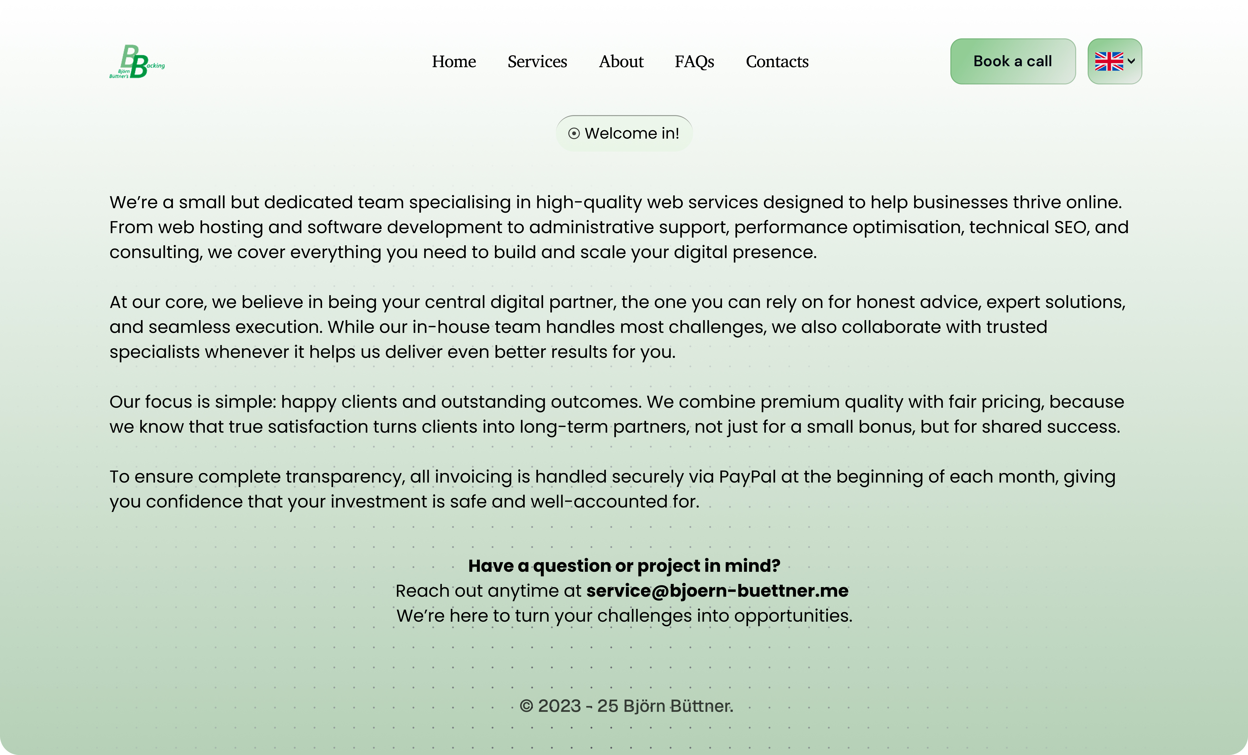
BB's Backing is Björn Büttner's web services and software development agency - delivering hosting infrastructure, performance optimization, technical SEO, API development, and strategic consulting across Europe. Real expertise. Real clients. Real results.
But Björn's website told a different story. He came to us with a problem most strong operators face: his digital presence had fallen behind the quality of the work he actually does. The ask was direct - rebuild it, and make it worthy of the clients he wants to attract.
The Diagnosis
Before we designed a single screen, we studied the existing site with one question in mind: what is this costing Björn? Not aesthetically - commercially.
The site wasn't broken. It communicated the services. But it was doing the bare minimum in a market where the gap between a €500 client and a €5,000 client is often decided in the first eight seconds of a visit.
- No visual authority. The design read as template-driven. It communicated "freelancer" when Björn's track record communicates "expert."
- Conversion paths buried. The most valuable actions - booking a consultation, requesting a quote, exploring services - required effort to find. Effort kills intent.
- Trust wasn't being earned. No confident brand voice. No social proof positioned where it could do work. No design language that said "we know what we're doing."
- The gap was compounding. Every visit from a serious prospect was a missed opportunity to make the kind of first impression that closes.
What We Set Out to Do
We weren't hired to make the site look better. We were hired to make it perform - to transform a digital presence into a business development asset that works around the clock.
- Build visual authority so that the website becomes proof of Björn's expertise, not a liability against it.
- Engineer the conversion path so that the right visitors reach the right actions with zero unnecessary friction.
- Deliver real strategic choice - two fully realized directions, not a single take-it-or-leave-it answer.
- Go beyond the brief - because that's the standard we hold ourselves to on every project.
How We Worked
Every phase of this project was anchored to one principle: design decisions must trace back to business outcomes. Not aesthetics, not trends - outcomes.
01Discovery & Audit
We mapped every page, every user action, every piece of content against a single question: what does a high-value prospect need to see to trust Björn enough to reach out? The existing site answered that question poorly. We documented the gaps precisely so we could close them precisely.
02Information Architecture & UX
We rebuilt the hierarchy from first principles: Hero → Services → Proof → Contact. Every section earns its position. CTAs appear at the moments a visitor's intent is highest - not sprinkled for coverage, but placed for conversion. Navigation was reduced to what matters and nothing else.
03Two Production-Ready Directions
Going beyond the brief, we developed two fully realized design concepts - not wireframes, not sketches, but production-ready directions each with its own visual logic and strategic purpose. The goal was to give Björn genuine optionality, not a single forced answer.
Two Directions, One Clear Vision
Both variants share the same structural logic and conversion architecture. What differs is the emotional register - the feeling a visitor carries away after those first few seconds on the site.
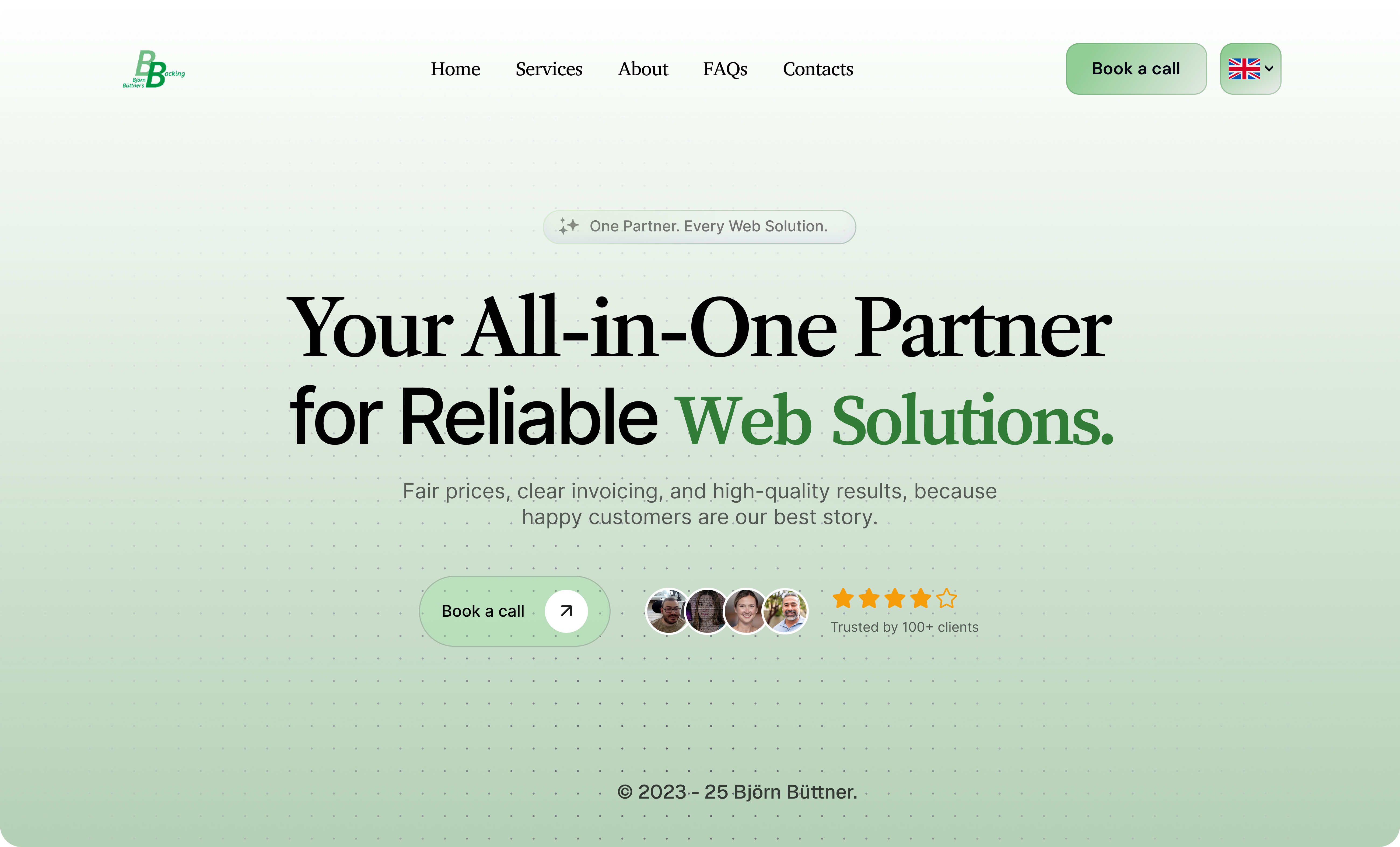
Variant A - Light / Premium & Minimal
A clean, restrained system built for trust. The light palette creates breathing room - letting the content lead while the design supports without competing. This is the direction for the client who wants to say: we are serious, and we don't need to shout.
- Refined type system with generous white space that signals precision.
- Neutral palette that positions the brand as confident - not flashy, not cold.
- Visual hierarchy that guides without pushing. Elegant. Deliberate. Earned.
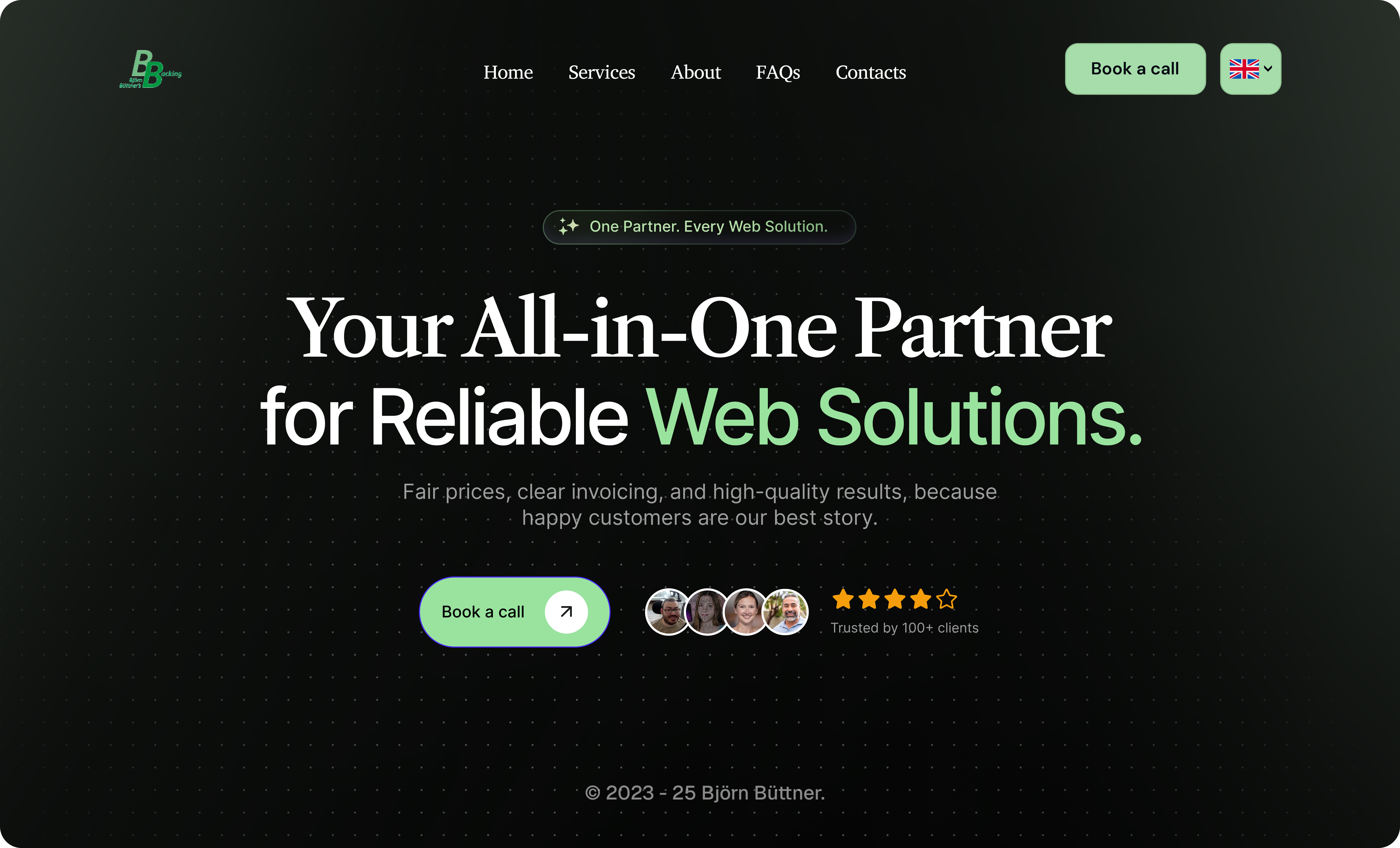
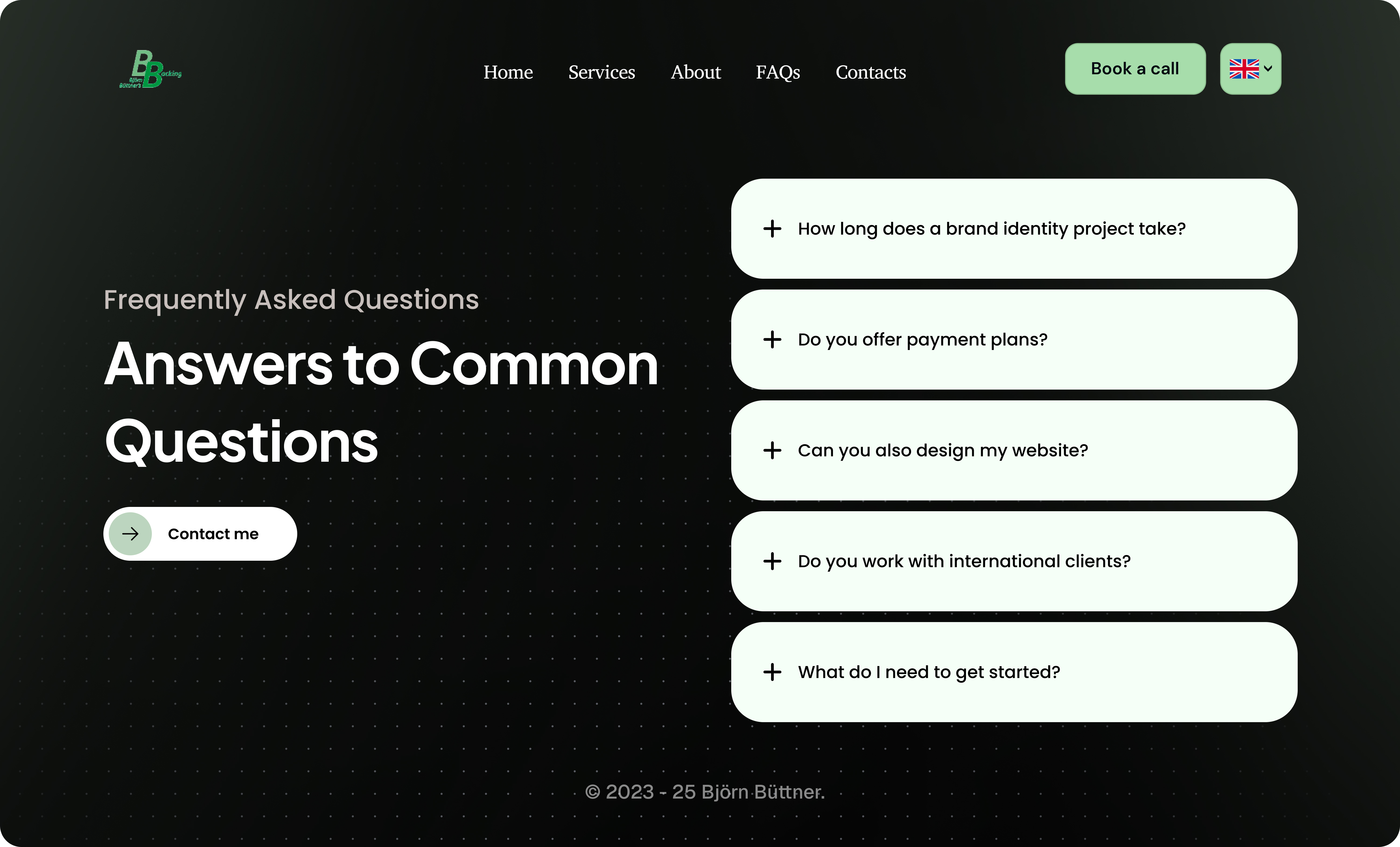
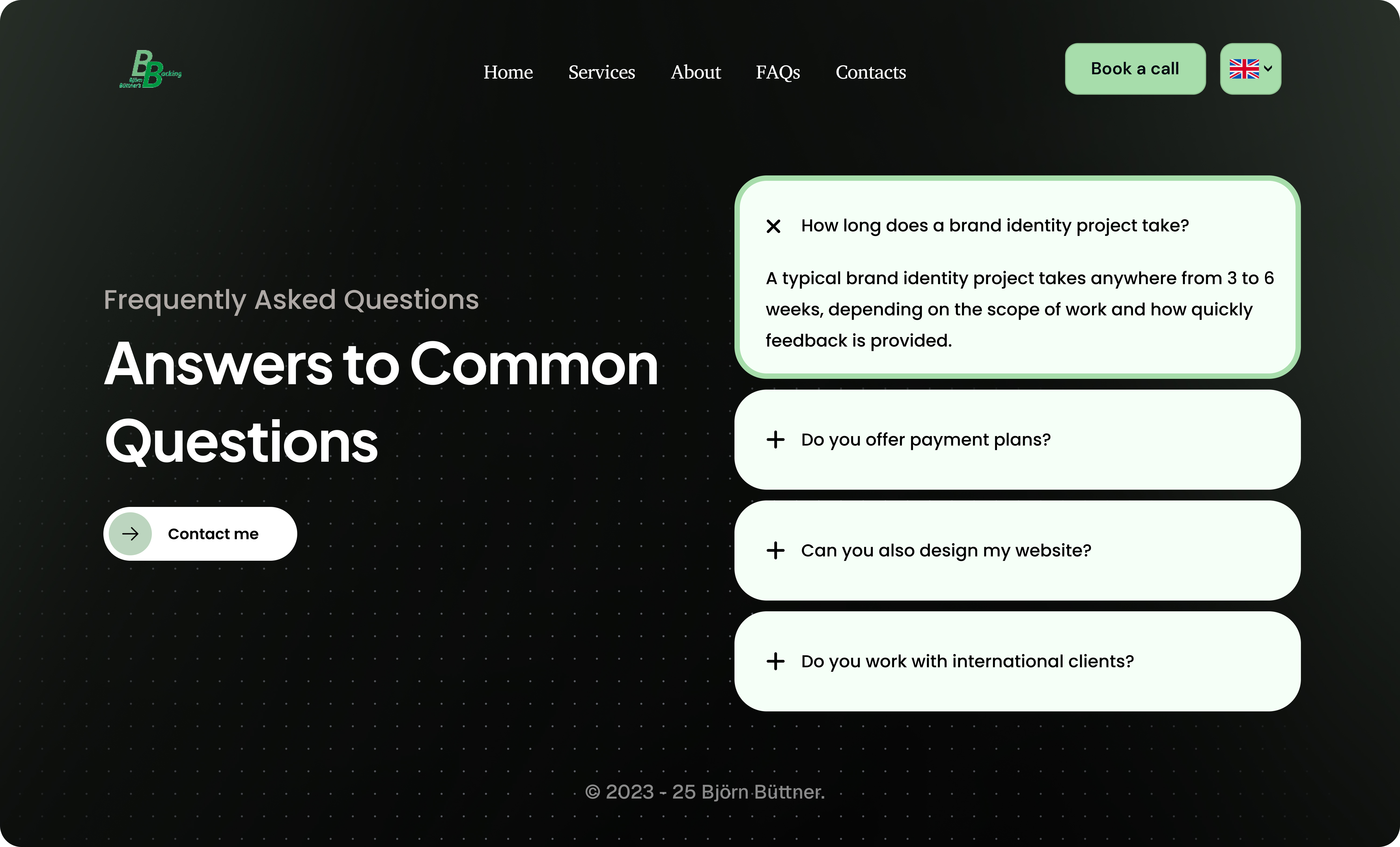
Variant B - Dark / Bold & High-Impact
A high-contrast system that commands attention the moment the page loads. The dark palette creates visual depth - drawing the eye exactly where we need it: the services, the CTAs, the next step. This is the direction for the client who wants to say: we are excellent, and we know it.
- Deep background creates contrast that makes key content impossible to miss.
- Bold CTAs that feel urgent without crossing into aggressive.
- A modern, high-energy visual language that signals ambition and expertise in equal measure.
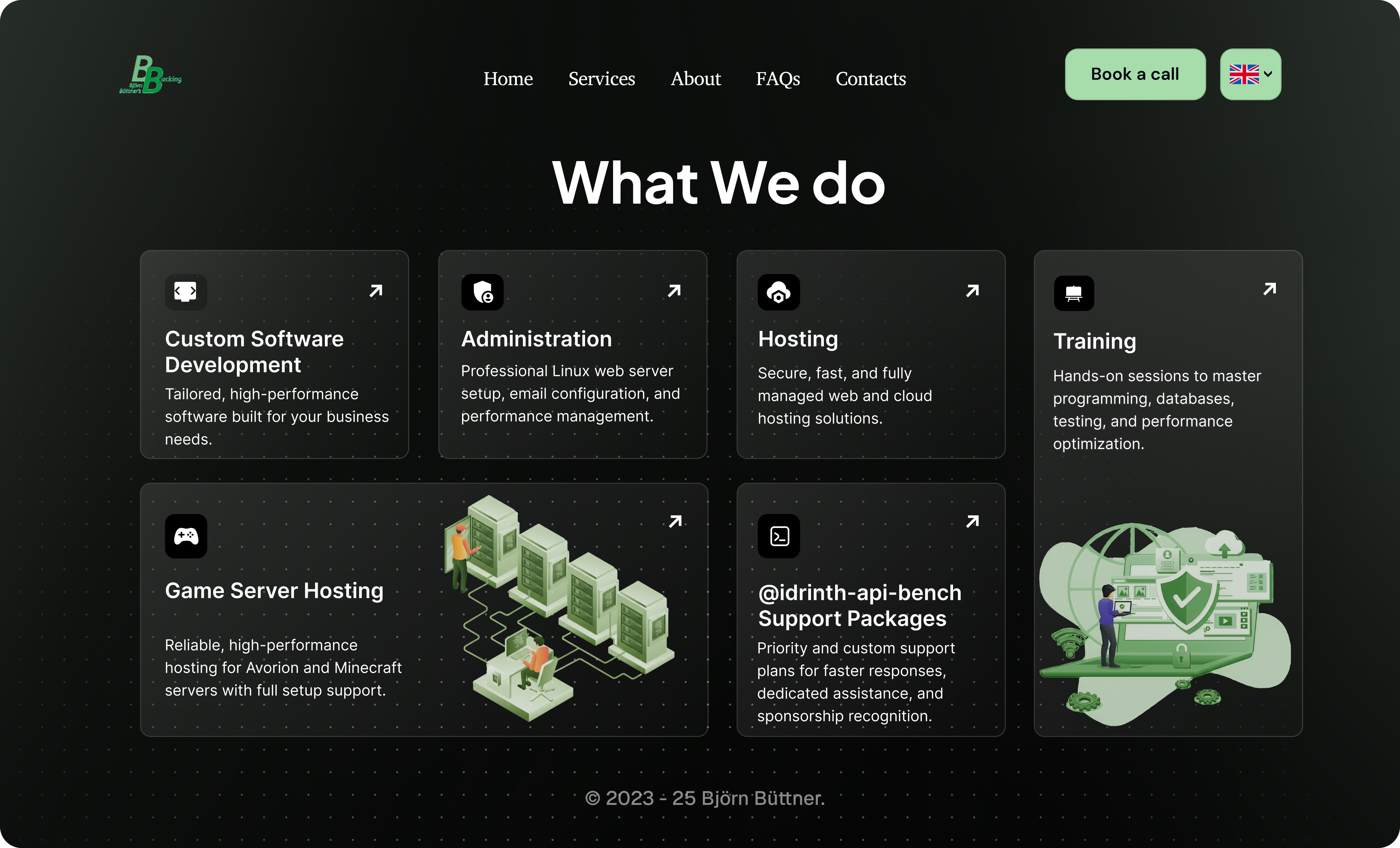
What We Built
Every decision in the final design is traceable to a specific problem we identified in the audit. Nothing is decorative for decoration's sake.
- Typography as authority. A refined type system that signals precision before the visitor reads a single word - because first impressions are made in milliseconds.
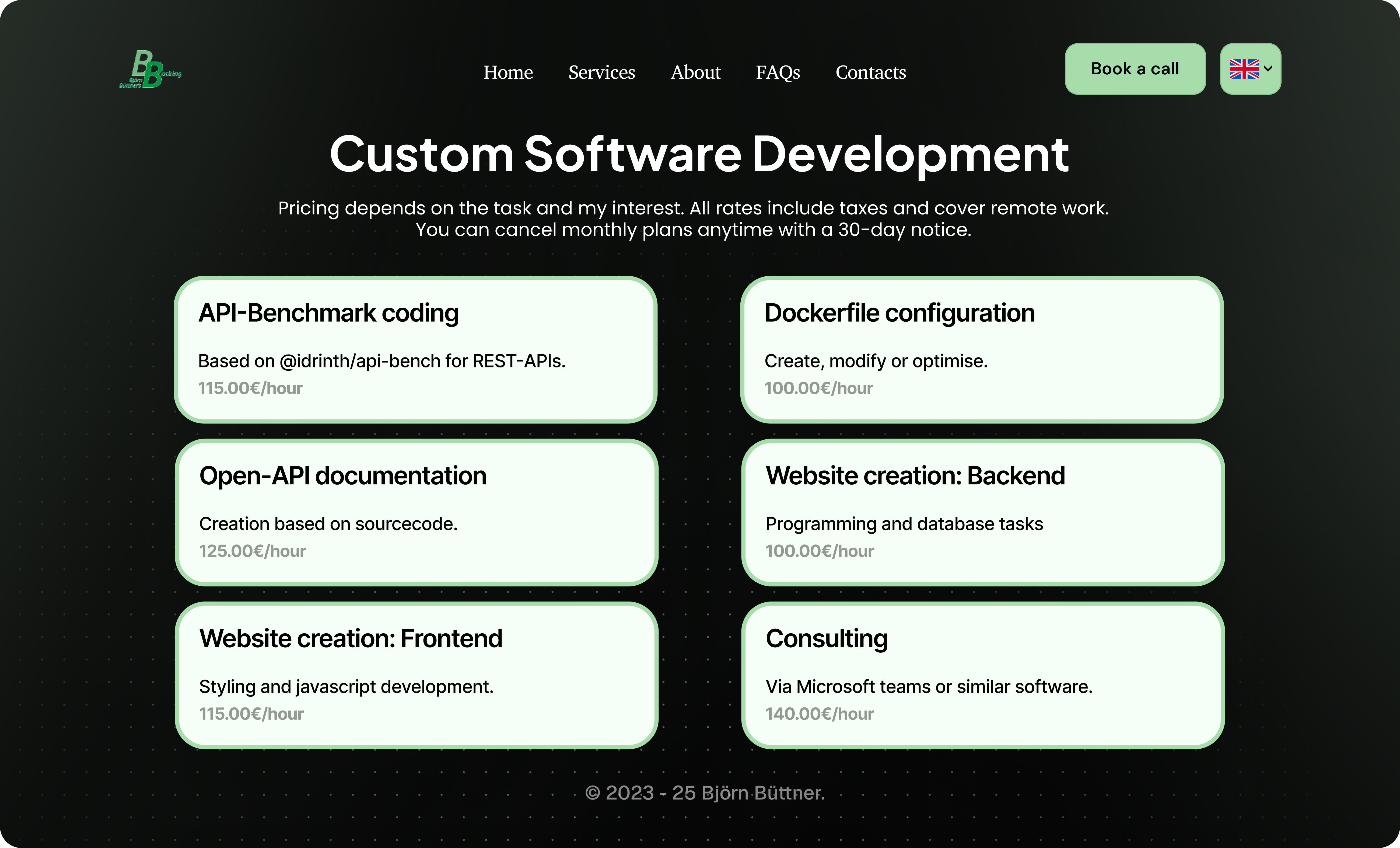
- Conversion architecture. CTAs at the exact moments intent is highest. Not scattered for visibility. Placed for action.
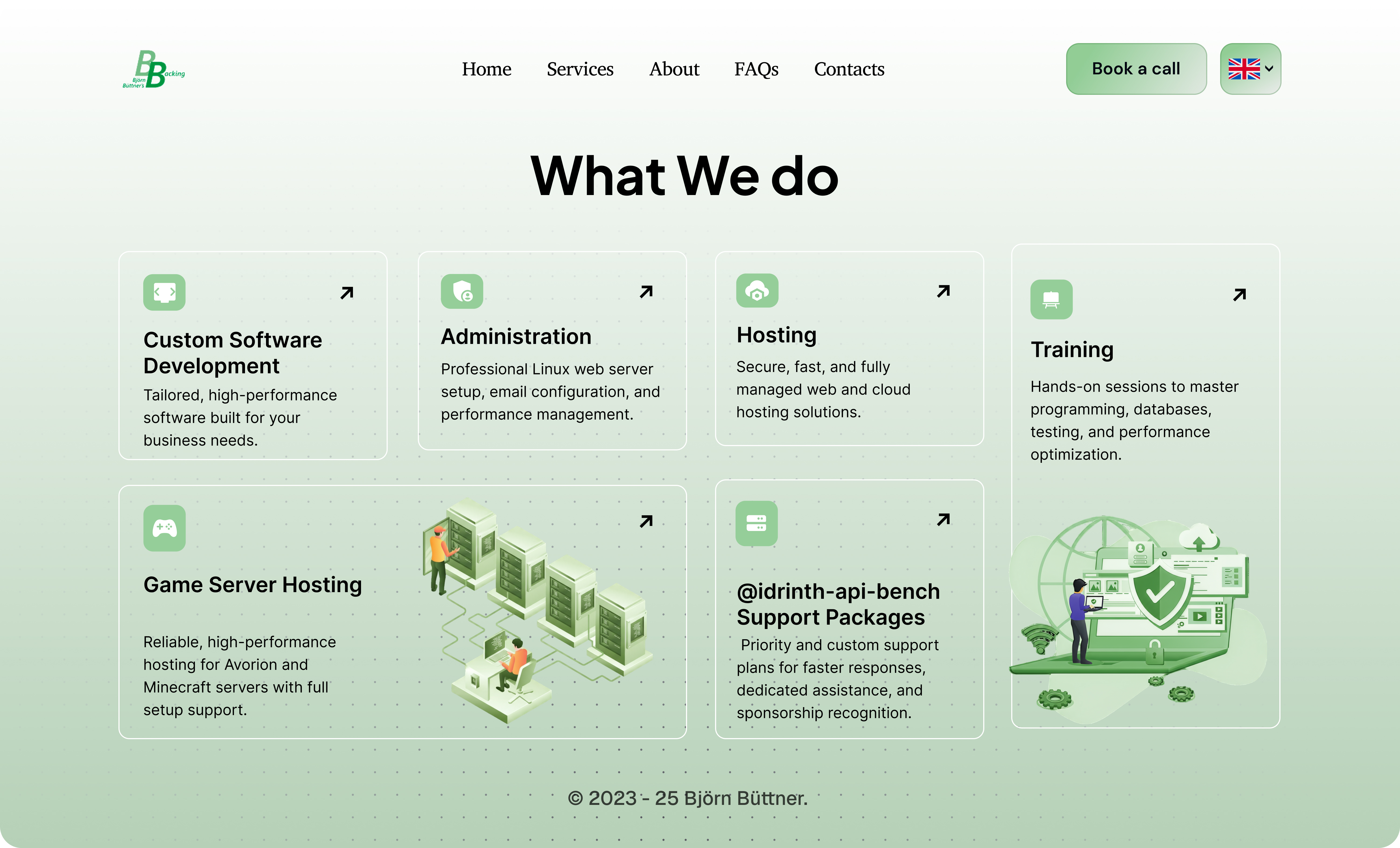
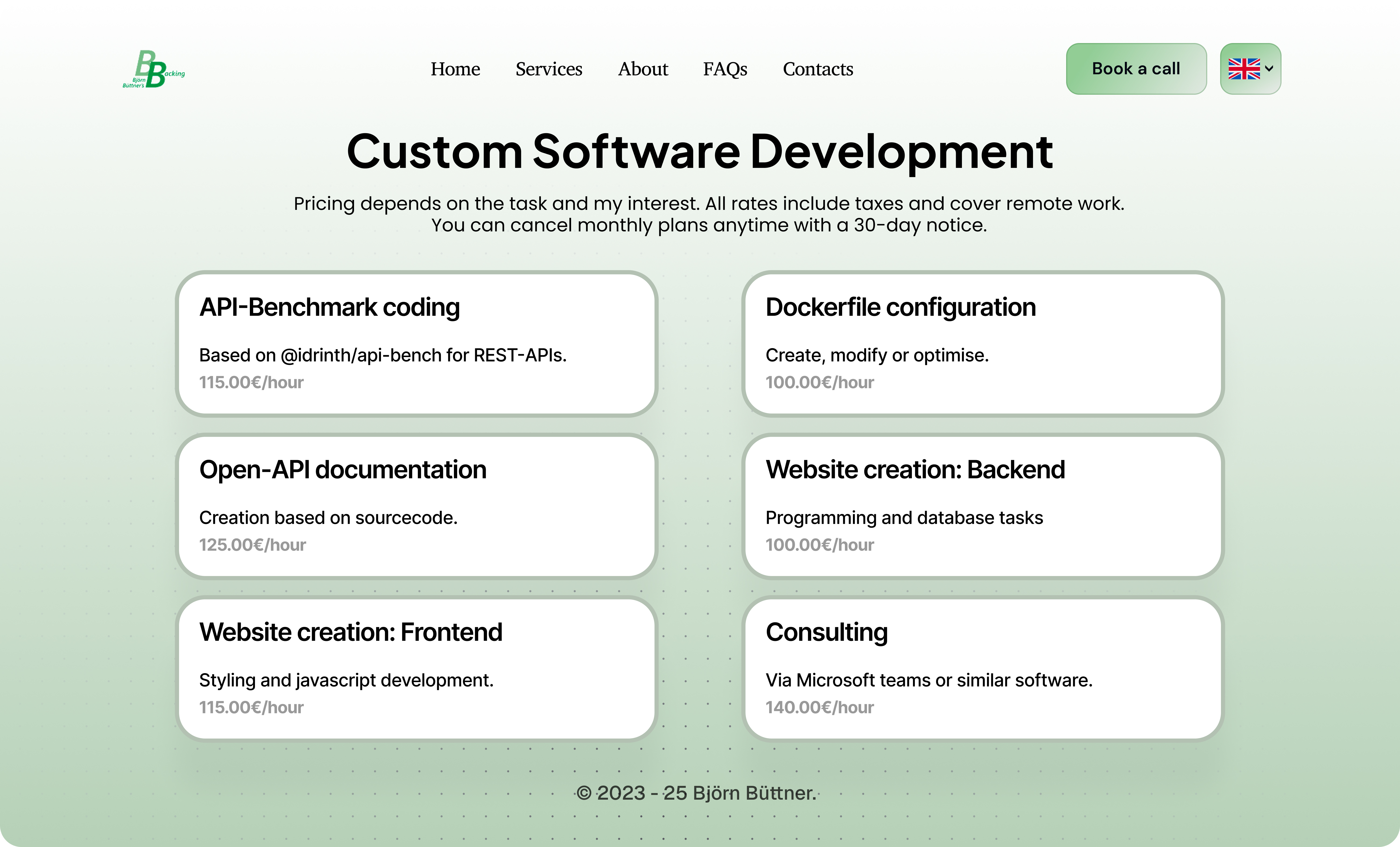
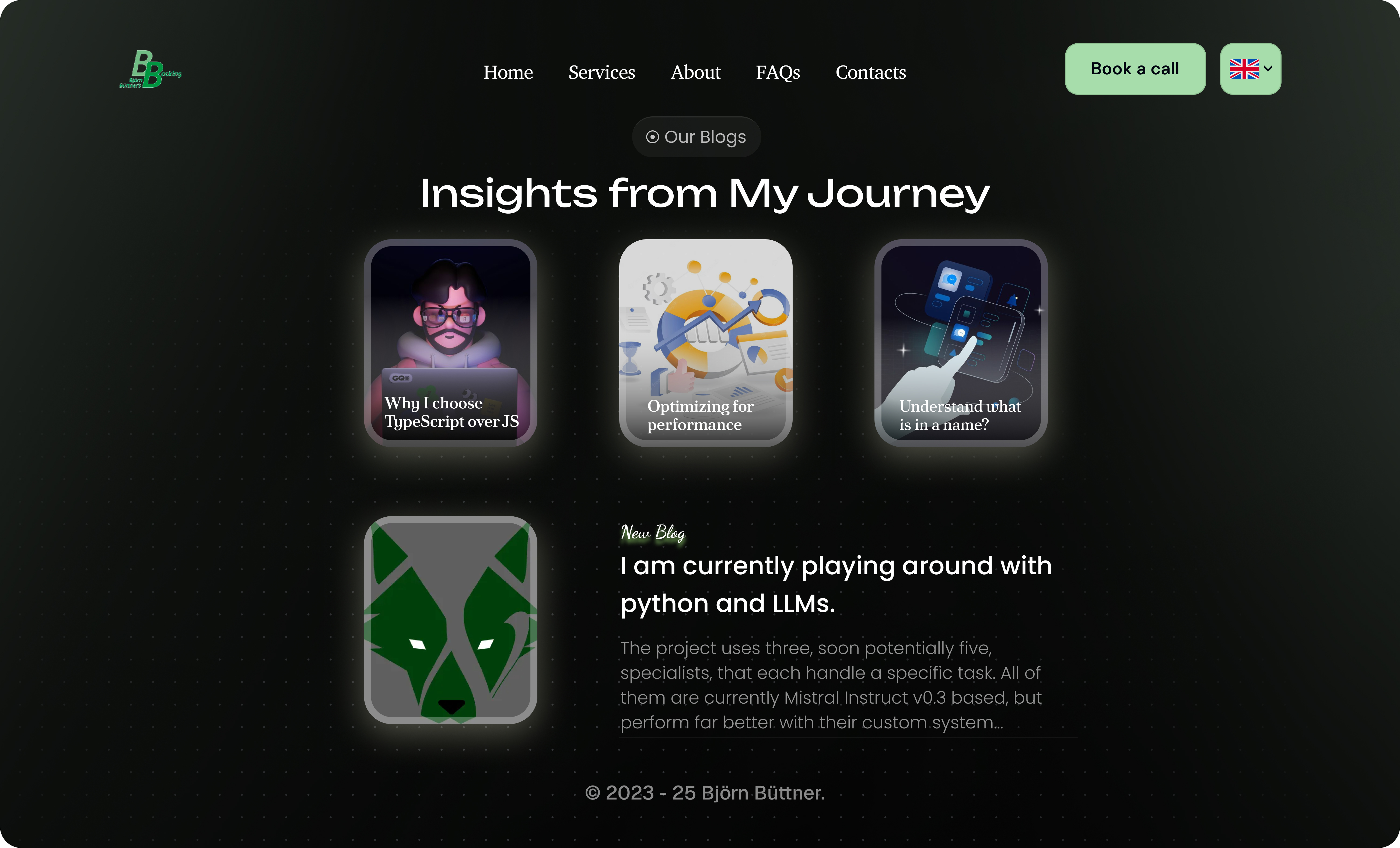
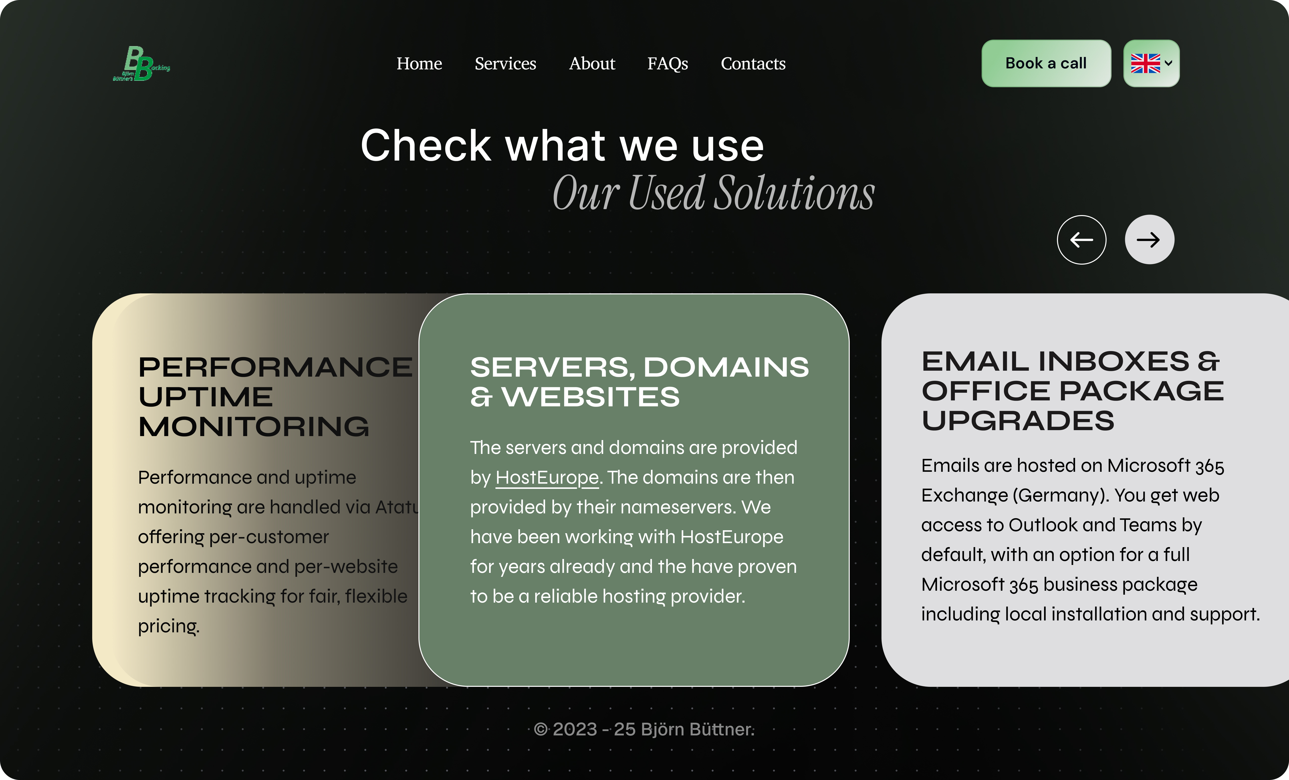
- Service clarity. Distinct visual blocks for each offering, engineered for scanning. Visitors understand the full value in under ten seconds.
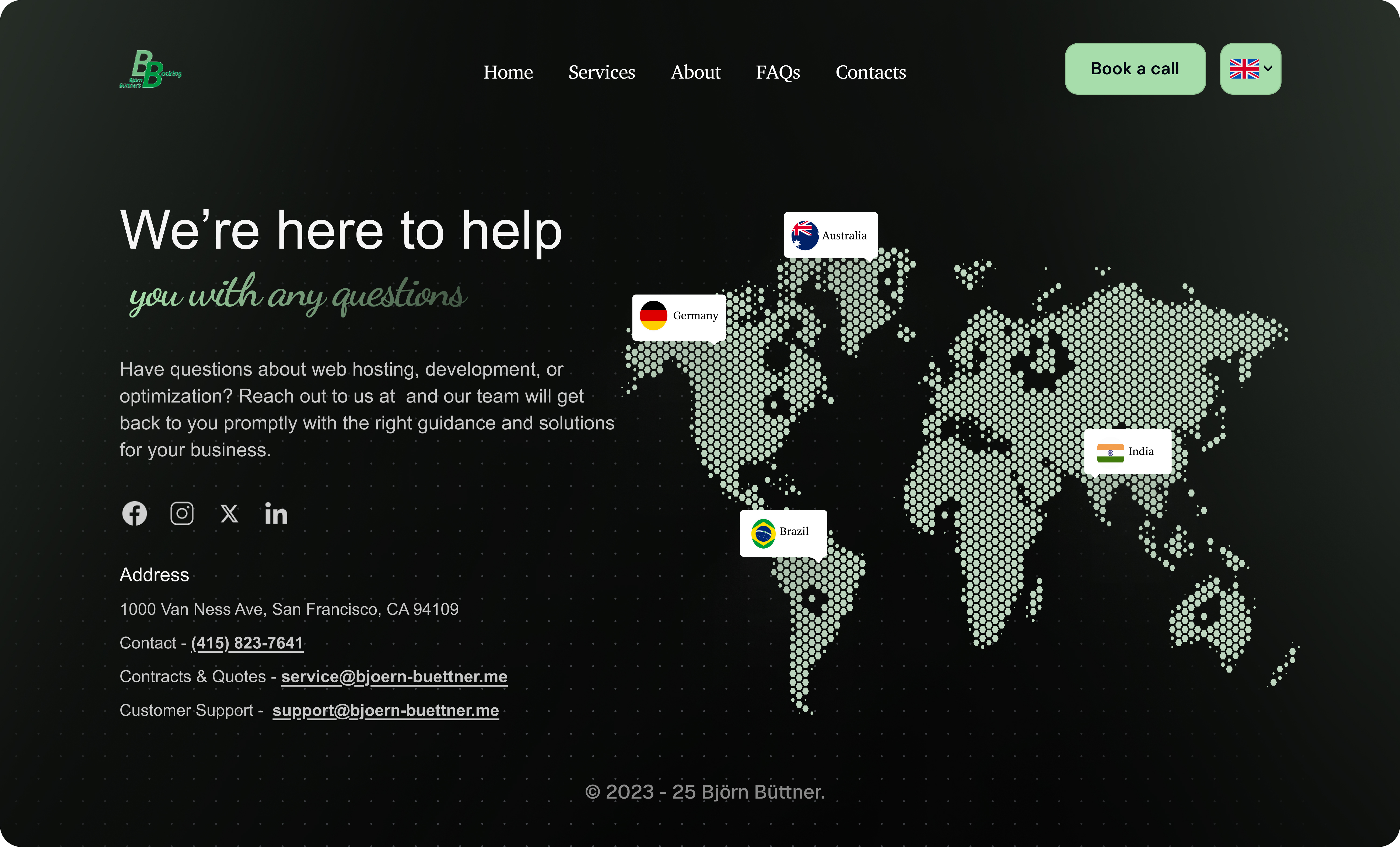
- Trust built into the layout. Social proof, contact options, and professional signals woven through the page - not added as an afterthought in the footer.
- Responsive without compromise. The experience is designed for every screen - not shrunk to fit, designed to perform.
What we got
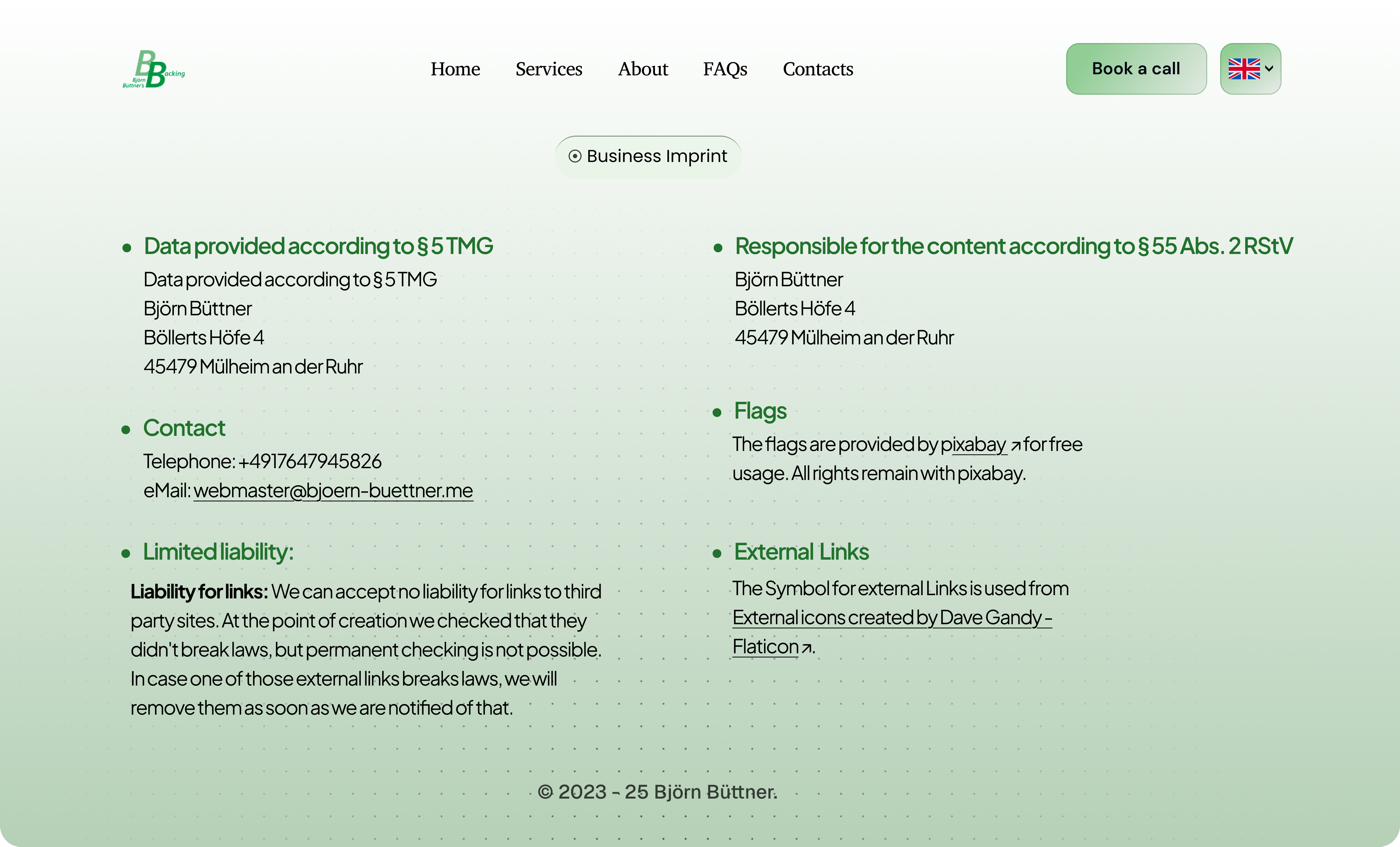
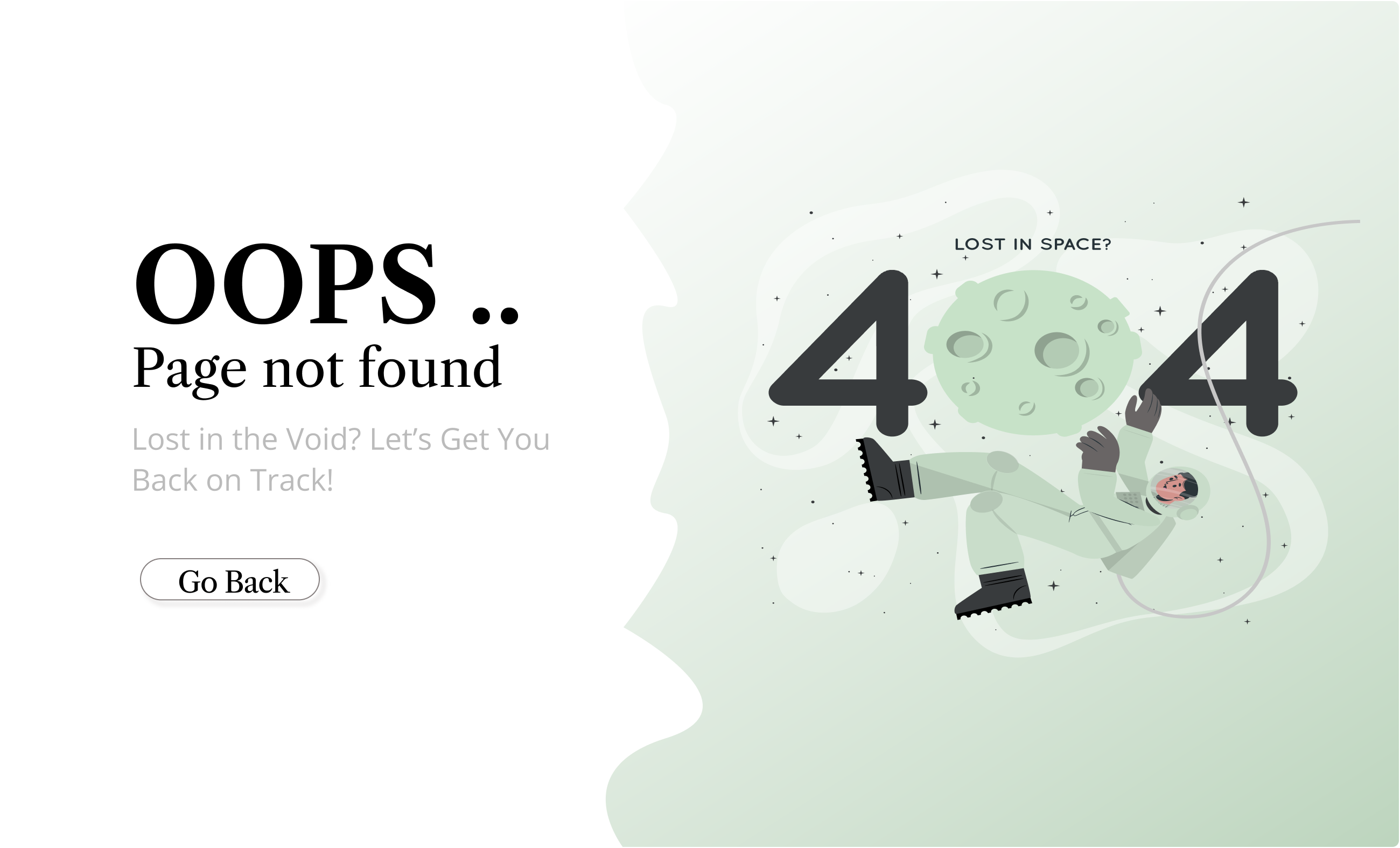
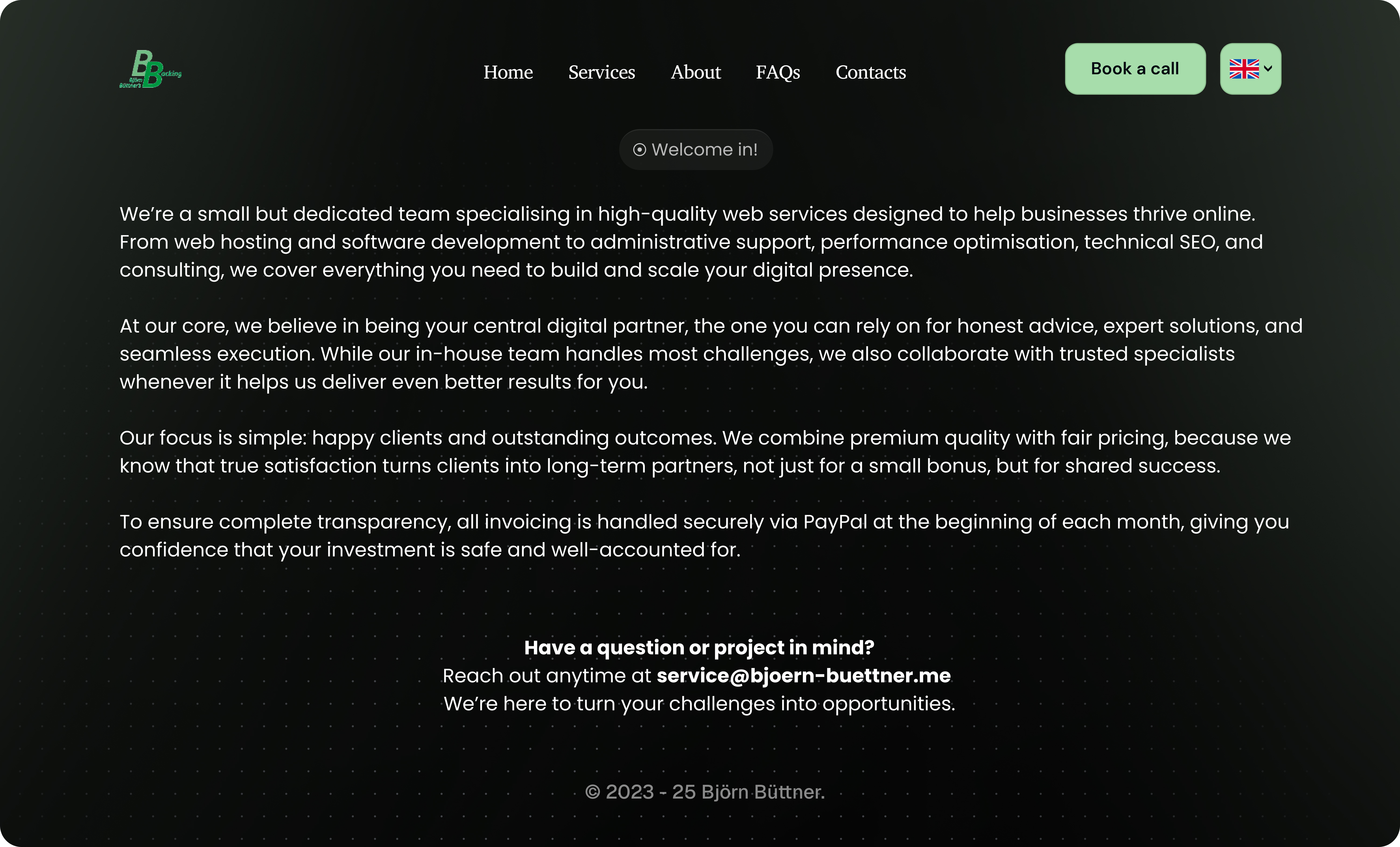
The existing site communicated competence. But competence alone doesn't win premium clients. Here's what we inherited - and what told us exactly where to focus.


What we made :)
Variant A - Light Mode
Clean. Trustworthy. Premium without trying. The light system prioritizes clarity and lets the content do the selling - every page designed so a prospect knows exactly where to look and what to do next.
Variant B - Dark Mode
Bold. High-contrast. Commanding. The dark system creates an experience that feels exclusive - the kind of site that makes a serious prospect stop scrolling and start reading.
What Changed
Good design is invisible. You know it's working when the site feels inevitable - when nothing feels out of place and everything points toward the right next step. That's the standard we applied here.
- Visual authority established. The redesign immediately positions BB's Backing at the level of the clients Björn wants to attract - not the clients he's outgrown.
- Conversion paths made obvious. Every key action - booking, inquiry, service discovery - is now a clear, natural next step for a motivated visitor.
- Trust built into every screen. The design earns confidence before a single word is read, through typography, hierarchy, and visual consistency.
- Strategic flexibility delivered. Two fully realized directions gave Björn real choice - and the confidence that comes from understanding exactly what each direction says about his brand.
"The client responded very positively to the redesign, appreciating the modern direction, the attention to detail, and the added value delivered well beyond the original scope."